In today’s tutorial, we will learn about Notification badges in Kotlin Compose Multiplatform (KMP/KMM) for Android, iOS, and web platforms. We will be using the BadgeBox and Badge components.
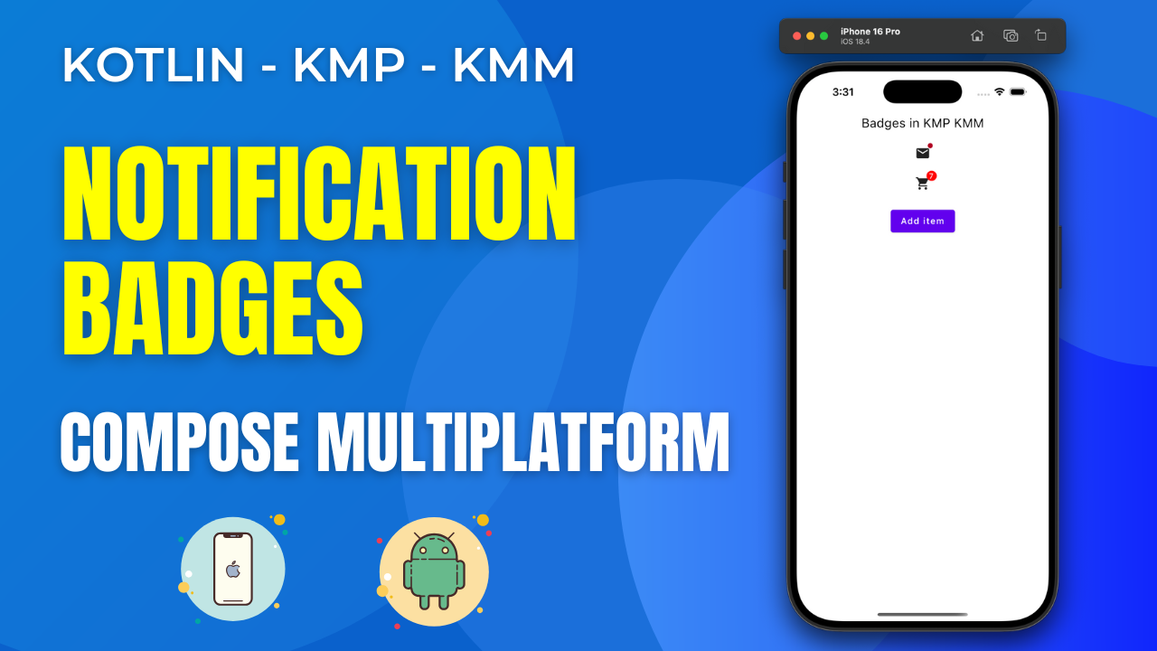
Notification Badges in Kotlin Compose Multiplatform KMP KMM:
Badges are a vital UI component in KMP that displays notification counts in applications. KMP offers custom Badges that can be customized and directly integrated as a separate UI component with all the properties to modify it. We can display notification counts or any other numerical updates in the Badges, as they can be easily controlled using the State.
Start coding for the app:
1. Creating a State named itemCount with a default value of zero.
|
1 |
var itemCount by remember { mutableStateOf(0) } |
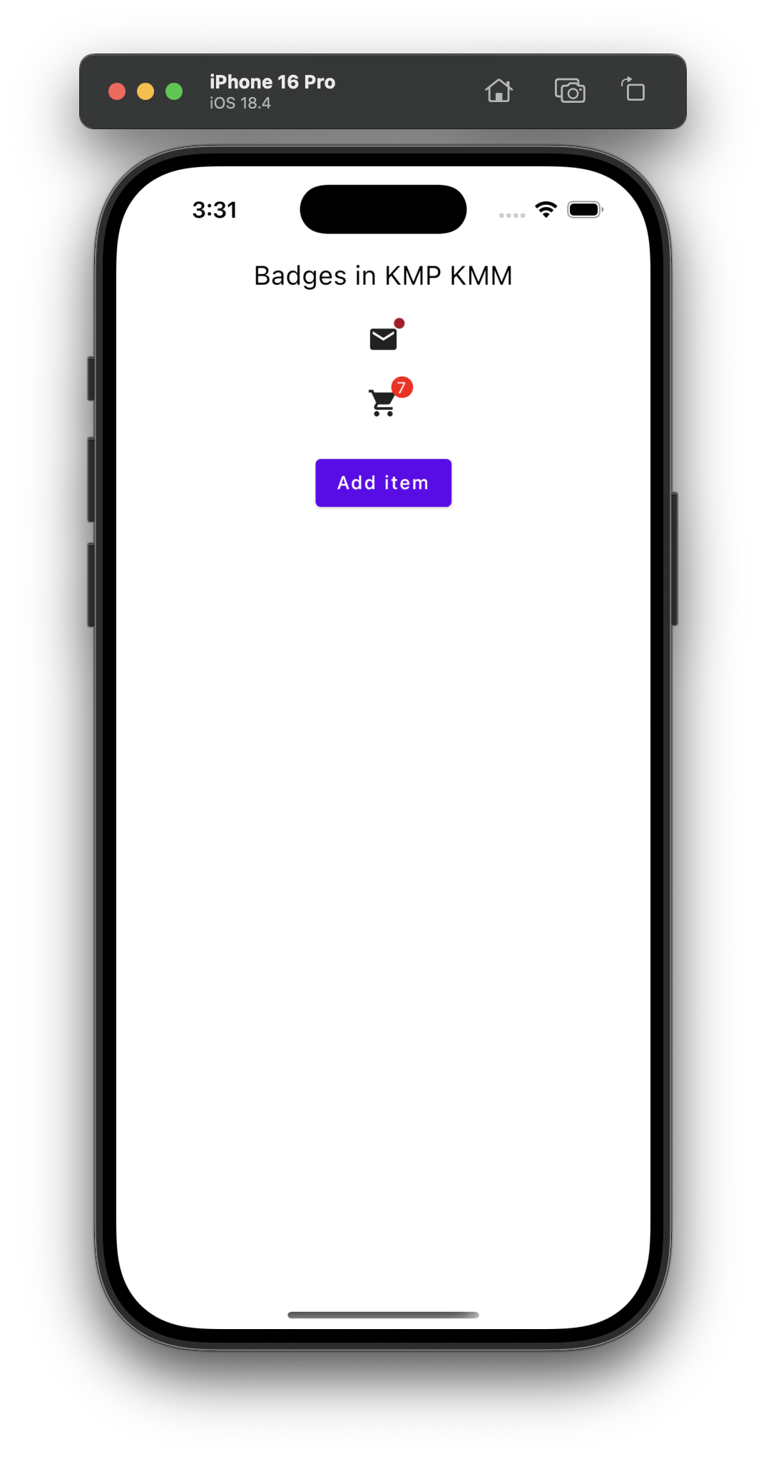
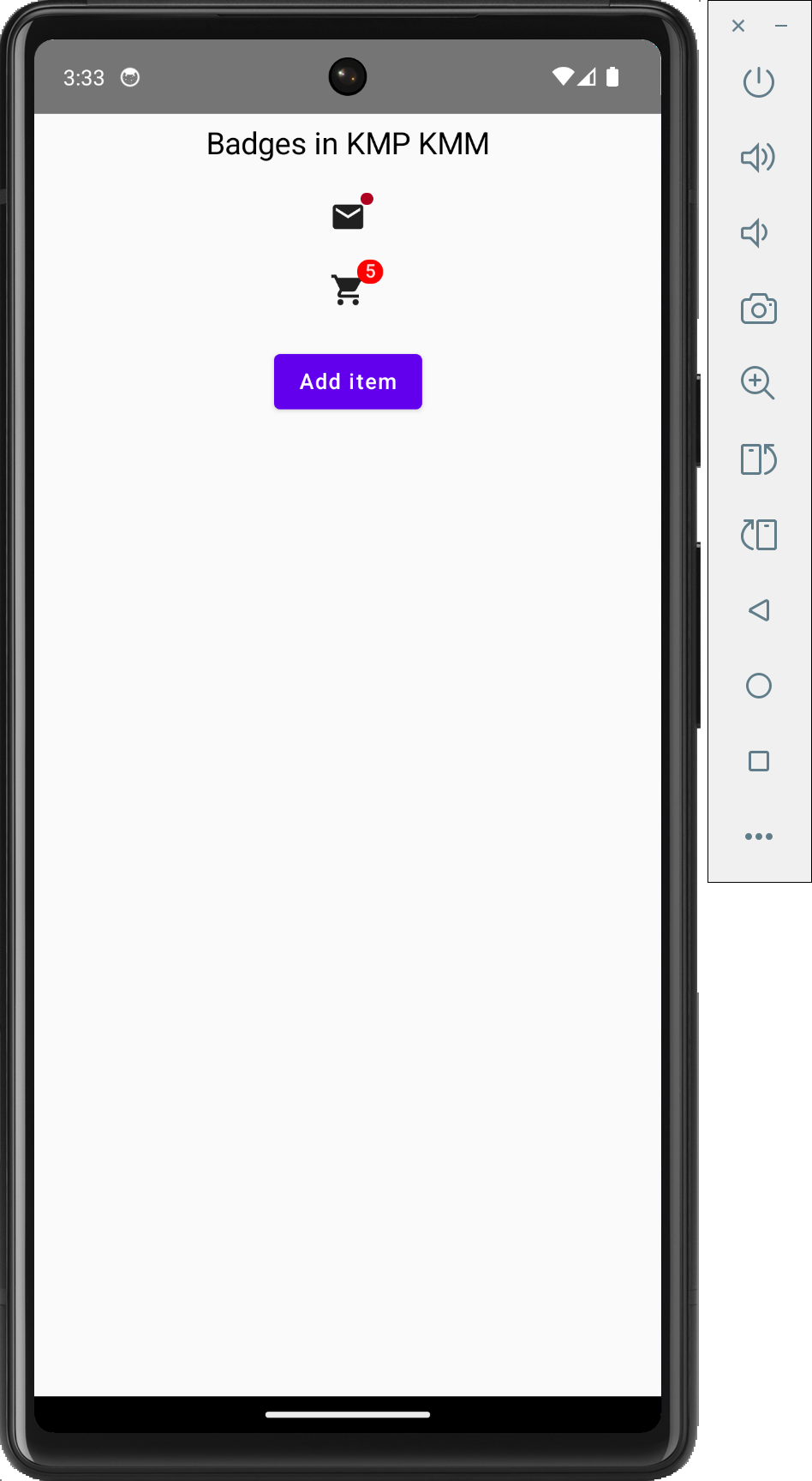
2. Creating BadgedBox with Email Icon.
|
1 2 3 4 5 6 7 8 9 10 |
BadgedBox( badge = { Badge() } ) { Icon( imageVector = Icons.Filled.Email, contentDescription = "Email" ) } |
Code explanation:
- BadgedBox wraps an Icon (email) with a Badge.
- The Badge() is empty, displaying a simple red dot.
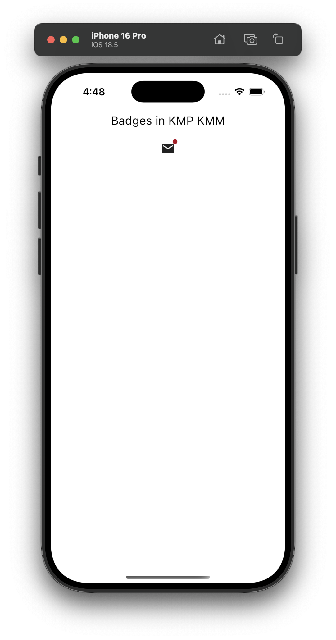
Screenshot:
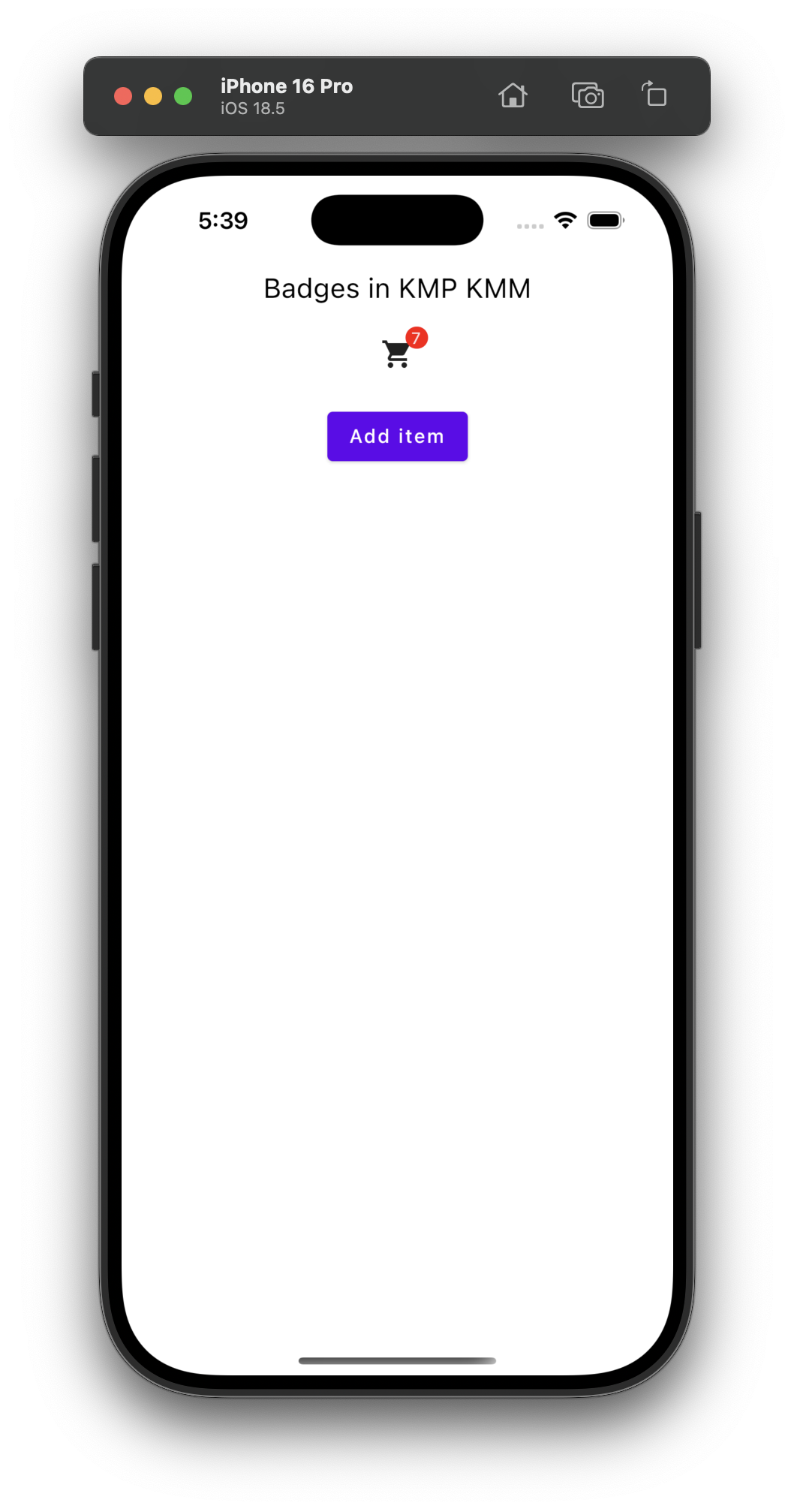
3. Creating a customised Badge with a number value:
|
1 2 3 4 5 6 7 8 9 10 11 12 13 14 15 16 17 18 19 20 21 |
BadgedBox( badge = { if (itemCount > 0) { Badge( backgroundColor = Color.Red, contentColor = Color.White, ) { Text("$itemCount", textAlign = TextAlign.Center, fontSize = 12.sp,) } } } ) { Icon( imageVector = Icons.Filled.ShoppingCart, contentDescription = "Shopping cart", ) } |
Code explanation:
- BadgedBox: Starts a Jetpack Compose component that positions a badge over content, such as an icon, using badge and content lambdas.
- Badge Lambda: Defines the badge’s appearance and behavior in a lambda for the badge parameter.
- If Condition (itemCount > 0): Checks if itemCount exceeds 0 to show the badge only for positive counts.
- Badge Composable: Creates a badge with a red background and white text, displayed when itemCount is positive.
- Text Inside Badge: Shows itemCount as a centered string with 12sp font size within the badge.
- Icon Composable: Displays a shopping cart icon with a “Shopping cart” accessibility description.
- Overall Functionality: Combines icon and badge, displaying the badge over the icon when itemCount > 0, and updates dynamically.
Screenshot:
Complete source code of App.kt file:
|
1 2 3 4 5 6 7 8 9 10 11 12 13 14 15 16 17 18 19 20 21 22 23 24 25 26 27 28 29 30 31 32 33 34 35 36 37 38 39 40 41 42 43 44 45 46 47 48 49 50 51 52 53 54 55 56 57 58 59 60 61 62 63 64 65 66 67 68 69 70 71 72 73 74 75 76 77 78 79 80 81 82 83 84 85 86 87 88 89 90 91 92 93 94 95 96 97 |
package com.app.test import androidx.compose.foundation.layout.Arrangement import androidx.compose.foundation.layout.Column import androidx.compose.foundation.layout.Spacer import androidx.compose.foundation.layout.fillMaxSize import androidx.compose.material.MaterialTheme import androidx.compose.material.Text import androidx.compose.runtime.Composable import androidx.compose.ui.Modifier import androidx.compose.foundation.layout.fillMaxWidth import androidx.compose.foundation.layout.height import androidx.compose.foundation.layout.padding import androidx.compose.material.Badge import androidx.compose.material.BadgedBox import androidx.compose.material.Button import androidx.compose.material.Icon import androidx.compose.material.icons.Icons import androidx.compose.material.icons.filled.Email import androidx.compose.material.icons.filled.ShoppingCart import androidx.compose.runtime.getValue import androidx.compose.runtime.mutableStateOf import androidx.compose.runtime.remember import androidx.compose.runtime.setValue import androidx.compose.ui.Alignment import androidx.compose.ui.graphics.Color import androidx.compose.ui.text.TextStyle import androidx.compose.ui.text.style.TextAlign import androidx.compose.ui.unit.dp import androidx.compose.ui.unit.sp @Composable fun App() { var itemCount by remember { mutableStateOf(0) } MaterialTheme { Column( modifier = Modifier .fillMaxSize() .padding(8.dp), verticalArrangement = Arrangement.Top, horizontalAlignment = Alignment.CenterHorizontally ) { Text( "Badges in KMP KMM", modifier = Modifier.fillMaxWidth(), style = TextStyle(color = Color.Black, fontSize = 20.sp), textAlign = TextAlign.Center ) Spacer(Modifier.height(24.dp)) BadgedBox( badge = { Badge() } ) { Icon( imageVector = Icons.Filled.Email, contentDescription = "Email" ) } Spacer(Modifier.height(24.dp)) BadgedBox( badge = { if (itemCount > 0) { Badge( backgroundColor = Color.Red, contentColor = Color.White, ) { Text("$itemCount", textAlign = TextAlign.Center, fontSize = 12.sp,) } } } ) { Icon( imageVector = Icons.Filled.ShoppingCart, contentDescription = "Shopping cart", ) } Spacer(Modifier.height(24.dp)) Button(onClick = { itemCount++ }) { Text("Add item") } } } } |
Screenshot on an iOS device:
Screenshot on an Android device: