In today’s tutorial, we will learn how to build a ListView LazyColumn in Kotlin Compose Multiplatform KMP KMM for both Android & iOS platfroms. The LazyColumn is optimized in the same way as the RecyclerView component we have used in native Android (Java). This tutoiral covers the basics of LazyColumn using static data handling.
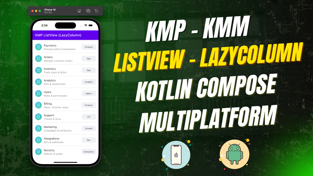
ListView LazyColumn in Kotlin Compose Multiplatform KMP KMM:
LazyColumn is a component in Kotlin Compose Multiplatform that allows us to build a ListView in a memory-efficient and optimized way. It loads items only when they are visible on the screen and assigns memory to them accordingly. This will ensure fast loading and better performance with a large number of datasets.
Start coding for the app:
1. Data Model:
First, we need to create a data model class that stores information for each item in the ListView. For this example, each item has an ID, title, subtitle, and a tag.
|
1 2 3 4 5 6 |
data class ListItem( val id: Int, val title: String, val subtitle: String, val tag: String ) |
2. Creating dummy list data:
After creating the data model, we need to populate it with dummy data.
|
1 2 3 4 5 6 7 8 9 10 11 12 13 14 15 16 17 18 19 20 21 22 23 24 |
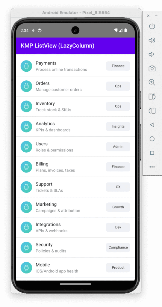
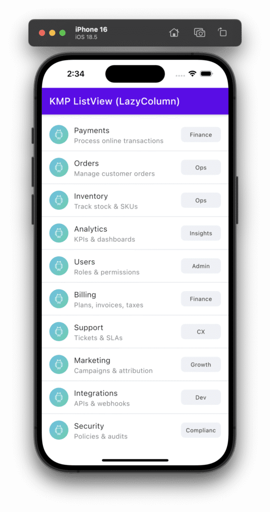
val items = remember { listOf( ListItem(1, "Payments", "Process online transactions", "Finance"), ListItem(2, "Orders", "Manage customer orders", "Ops"), ListItem(3, "Inventory", "Track stock & SKUs", "Ops"), ListItem(4, "Analytics", "KPIs & dashboards", "Insights"), ListItem(5, "Users", "Roles & permissions", "Admin"), ListItem(6, "Billing", "Plans, invoices, taxes", "Finance"), ListItem(7, "Support", "Tickets & SLAs", "CX"), ListItem(8, "Marketing", "Campaigns & attribution", "Growth"), ListItem(9, "Integrations", "APIs & webhooks", "Dev"), ListItem(10, "Security", "Policies & audits", "Compliance"), ListItem(11, "Mobile", "iOS/Android app health", "Product"), ListItem(12, "Logs", "Events & monitoring", "DevOps"), ListItem(13, "Geography", "Regions & availability", "Global"), ListItem(14, "A/B Tests", "Experiments & results", "Growth"), ListItem(15, "Reports", "Exports & scheduled emails", "Insights"), ListItem(16, "Vendors", "3rd-party & contracts", "Ops"), ListItem(17, "Returns", "RMA workflow & refunds", "Ops"), ListItem(18, "Checkout", "Conversion & drop-off", "Product"), ListItem(19, "Shipments", "Logistics & tracking", "Ops"), ListItem(20, "Alerts", "Thresholds & notifications", "DevOps") ) } |
3. Creating selected state: We will be creating a state named selected. This state is used to hold the item object selected from the List.
|
1 |
var selected by remember { mutableStateOf<ListItem?>(null) } |
4. Creating TopAppBar: To create an application App bar, we will use the TopAppBar component.
|
1 |
TopAppBar(title = { Text("KMP ListView (LazyColumn)") }) |
5. Creating LazyColumn: LazyColumn is our main component for today’s tutorial.
|
1 2 3 4 5 6 7 8 9 10 11 12 13 14 15 16 |
LazyColumn( modifier = Modifier .fillMaxSize() .padding(vertical = 8.dp) ) { // stable key & divider only between items itemsIndexed(items, key = { _, item -> item.id }) { index, item -> ListRow( item = item, onClick = { selected = item } ) if (index < items.lastIndex) { Divider() } } } |
Code explanation:
- modifier = Modifier.fillMaxSize().padding(vertical = 8.dp): The LazyColumn is stretched to fill the available space with some vertical padding for spacing between items.
- itemsIndexed(items, key = { _, item -> item.id }): This function renders each item in the list using its index and the item.id as the unique key. It is important for performance, as it helps Jetpack Compose efficiently manage and update the list when items change.
- ListRow: For each item in the list, we use the ListRow Composable to render the content.
- if (index < items.lastIndex) { Divider() }: A Divider is added between items, but not after the last item. This ensures the divider only separates the items in the list.
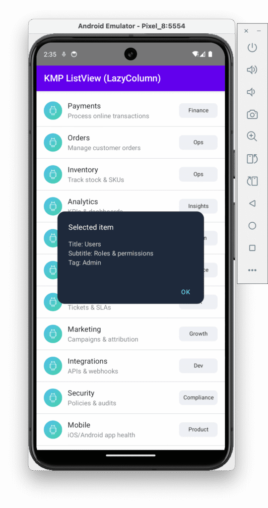
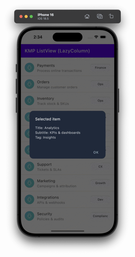
6. Creating AlertDialog: The alert dialog is used to show the selected item on the app screen when the user taps on the item.
|
1 2 3 4 5 6 7 8 9 10 11 12 13 14 15 16 17 18 19 20 21 22 23 |
val dialogItem = selected if (dialogItem != null) { AlertDialog( onDismissRequest = { selected = null }, title = { Text("Selected item", color = Color.White) }, text = { Column { Text("Title: ${dialogItem.title}", color = Color(0xFFCBD5E1)) Text("Subtitle: ${dialogItem.subtitle}", color = Color(0xFFCBD5E1)) Text("Tag: ${dialogItem.tag}", color = Color(0xFFCBD5E1)) } }, confirmButton = { TextButton( onClick = { selected = null }, colors = ButtonDefaults.textButtonColors(contentColor = Color(0xFF60A5FA)) ) { Text("OK") } }, backgroundColor = Color(0xFF1E293B), contentColor = Color.White, shape = RoundedCornerShape(16.dp) ) } |
Code explanation:
- onDismissRequest = { selected = null }: When the user taps outside the dialog or presses the back button, the selected item is cleared, closing the dialog.
- Title, text, and confirmButton: The dialog displays the title, subtitle, and tag of the selected item, and a button labeled “OK” to dismiss the dialog.
- backgroundColor: Sets the background color of the dialog.
- contentColor: Defines the color of the text inside the dialog.
7. Creating LazyColumn Item Layout:
This is the layout for each individual item (or ListRow) in the list.
|
1 2 3 4 5 6 7 8 9 10 11 12 13 14 15 16 17 18 19 20 21 22 23 24 25 26 27 28 29 30 31 32 33 34 35 36 37 38 39 40 41 42 43 44 45 46 47 48 49 |
@Composable private fun ListRow(item: ListItem, onClick: () -> Unit) { Row( modifier = Modifier .fillMaxWidth() .clickable { onClick() } .padding(horizontal = 16.dp, vertical = 12.dp), verticalAlignment = Alignment.CenterVertically ) { Image( painter = painterResource(Res.drawable.demo_image), contentDescription = null, modifier = Modifier .size(40.dp) .clip(CircleShape), contentScale = ContentScale.Crop ) Spacer(Modifier.width(12.dp)) Column(modifier = Modifier.weight(1f)) { Text(text = item.title, style = MaterialTheme.typography.subtitle1) Text( text = item.subtitle, style = MaterialTheme.typography.body2, color = Color.Gray ) } Spacer(Modifier.width(8.dp)) // Fixed-width chip with centered text Surface( color = Color(0xFFEFF1F5), shape = RoundedCornerShape(8.dp), modifier = Modifier .width(84.dp) .height(32.dp) ) { Box( modifier = Modifier.fillMaxSize(), contentAlignment = Alignment.Center ) { Text( text = item.tag, style = MaterialTheme.typography.caption, textAlign = TextAlign.Center, maxLines = 1 ) } } } } |
Code explanation:
- Row: A Row is used to arrange the contents horizontally (Image, Title, Subtitle, and Tag).
- modifier = Modifier.fillMaxWidth(): The row stretches to fill the full width of the parent.
- clickable { onClick() }: This makes the row clickable. When clicked, the onClick function is triggered, and the selected item is passed back.
- padding(horizontal = 16.dp, vertical = 12.dp): Adds padding inside the row for better spacing.
- Image: Displays an image next to the item. The image is circular because of the clip(CircleShape) modifier.
- painter = painterResource(Res.drawable.demo_image): This line loads the image resource for the item.
- size(40.dp): The image size is set to 40×40 dp.
- Column: The title and subtitle of the item are displayed vertically inside a Column.
- text = item.title: Displays the item’s title.
- text = item.subtitle: Displays the item’s subtitle in gray color.
- Surface: The tag is displayed inside a rounded rectangular box using a Surface:
- modifier = Modifier.width(84.dp).height(32.dp): The width and height of the tag are fixed, ensuring consistency in the design.
- Box(contentAlignment = Alignment.Center): Ensures that the text inside the tag is centered both horizontally and vertically.
- Text(text = item.tag): Displays the tag value inside the box.
Complete Source Code for App.kt file:
|
1 2 3 4 5 6 7 8 9 10 11 12 13 14 15 16 17 18 19 20 21 22 23 24 25 26 27 28 29 30 31 32 33 34 35 36 37 38 39 40 41 42 43 44 45 46 47 48 49 50 51 52 53 54 55 56 57 58 59 60 61 62 63 64 65 66 67 68 69 70 71 72 73 74 75 76 77 78 79 80 81 82 83 84 85 86 87 88 89 90 91 92 93 94 95 96 97 98 99 100 101 102 103 104 105 106 107 108 109 110 111 112 113 114 115 116 117 118 119 120 121 122 123 124 125 126 127 128 129 130 131 132 133 134 135 136 137 138 139 140 141 142 143 144 145 146 147 148 149 150 151 152 153 154 155 156 157 158 159 160 161 162 163 164 |
package com.app.test import androidx.compose.foundation.Image import androidx.compose.foundation.clickable import androidx.compose.foundation.layout.* import androidx.compose.foundation.lazy.LazyColumn import androidx.compose.foundation.lazy.itemsIndexed import androidx.compose.foundation.shape.CircleShape import androidx.compose.foundation.shape.RoundedCornerShape import androidx.compose.material.* import androidx.compose.runtime.* import androidx.compose.ui.Alignment import androidx.compose.ui.Modifier import androidx.compose.ui.draw.clip import androidx.compose.ui.graphics.Color import androidx.compose.ui.layout.ContentScale import androidx.compose.ui.text.style.TextAlign import androidx.compose.ui.unit.dp import org.jetbrains.compose.resources.painterResource import testapp.composeapp.generated.resources.Res import testapp.composeapp.generated.resources.demo_image // Model data class ListItem( val id: Int, val title: String, val subtitle: String, val tag: String ) @Composable fun App() { MaterialTheme { Surface(modifier = Modifier.fillMaxSize()) { ListScreen() } } } @Composable private fun ListScreen() { // Sample data — replace with your real arrays / source if needed val items = remember { listOf( ListItem(1, "Payments", "Process online transactions", "Finance"), ListItem(2, "Orders", "Manage customer orders", "Ops"), ListItem(3, "Inventory", "Track stock & SKUs", "Ops"), ListItem(4, "Analytics", "KPIs & dashboards", "Insights"), ListItem(5, "Users", "Roles & permissions", "Admin"), ListItem(6, "Billing", "Plans, invoices, taxes", "Finance"), ListItem(7, "Support", "Tickets & SLAs", "CX"), ListItem(8, "Marketing", "Campaigns & attribution", "Growth"), ListItem(9, "Integrations", "APIs & webhooks", "Dev"), ListItem(10, "Security", "Policies & audits", "Compliance"), ListItem(11, "Mobile", "iOS/Android app health", "Product"), ListItem(12, "Logs", "Events & monitoring", "DevOps"), ListItem(13, "Geography", "Regions & availability", "Global"), ListItem(14, "A/B Tests", "Experiments & results", "Growth"), ListItem(15, "Reports", "Exports & scheduled emails", "Insights"), ListItem(16, "Vendors", "3rd-party & contracts", "Ops"), ListItem(17, "Returns", "RMA workflow & refunds", "Ops"), ListItem(18, "Checkout", "Conversion & drop-off", "Product"), ListItem(19, "Shipments", "Logistics & tracking", "Ops"), ListItem(20, "Alerts", "Thresholds & notifications", "DevOps") ) } var selected by remember { mutableStateOf<ListItem?>(null) } Column(modifier = Modifier.fillMaxSize()) { TopAppBar(title = { Text("KMP ListView (LazyColumn)") }) LazyColumn( modifier = Modifier .fillMaxSize() .padding(vertical = 8.dp) ) { // stable key & divider only between items itemsIndexed(items, key = { _, item -> item.id }) { index, item -> ListRow( item = item, onClick = { selected = item } ) if (index < items.lastIndex) { Divider() } } } } // NPE-safe dialog: capture current selection before clearing it val dialogItem = selected if (dialogItem != null) { AlertDialog( onDismissRequest = { selected = null }, title = { Text("Selected item", color = Color.White) }, text = { Column { Text("Title: ${dialogItem.title}", color = Color(0xFFCBD5E1)) Text("Subtitle: ${dialogItem.subtitle}", color = Color(0xFFCBD5E1)) Text("Tag: ${dialogItem.tag}", color = Color(0xFFCBD5E1)) } }, confirmButton = { TextButton( onClick = { selected = null }, colors = ButtonDefaults.textButtonColors(contentColor = Color(0xFF60A5FA)) ) { Text("OK") } }, backgroundColor = Color(0xFF1E293B), contentColor = Color.White, shape = RoundedCornerShape(16.dp) ) } } @Composable private fun ListRow(item: ListItem, onClick: () -> Unit) { Row( modifier = Modifier .fillMaxWidth() .clickable { onClick() } .padding(horizontal = 16.dp, vertical = 12.dp), verticalAlignment = Alignment.CenterVertically ) { Image( painter = painterResource(Res.drawable.demo_image), contentDescription = null, modifier = Modifier .size(40.dp) .clip(CircleShape), contentScale = ContentScale.Crop ) Spacer(Modifier.width(12.dp)) Column(modifier = Modifier.weight(1f)) { Text(text = item.title, style = MaterialTheme.typography.subtitle1) Text( text = item.subtitle, style = MaterialTheme.typography.body2, color = Color.Gray ) } Spacer(Modifier.width(8.dp)) // Fixed-width chip with centered text Surface( color = Color(0xFFEFF1F5), shape = RoundedCornerShape(8.dp), modifier = Modifier .width(84.dp) .height(32.dp) ) { Box( modifier = Modifier.fillMaxSize(), contentAlignment = Alignment.Center ) { Text( text = item.tag, style = MaterialTheme.typography.caption, textAlign = TextAlign.Center, maxLines = 1 ) } } } } |
Screenshot on an Android device:
Screenshot on an iOS device: