In today’s tutorial, we will learn how to implement a Material Design Bottom Sheet in KMP KMM Compose Multiplatform for both Android & iOS platforms. This comprehensive guide explains all the code steps in detail, step by step. We are using the ModalBottomSheetLayout component, so let’s get started.
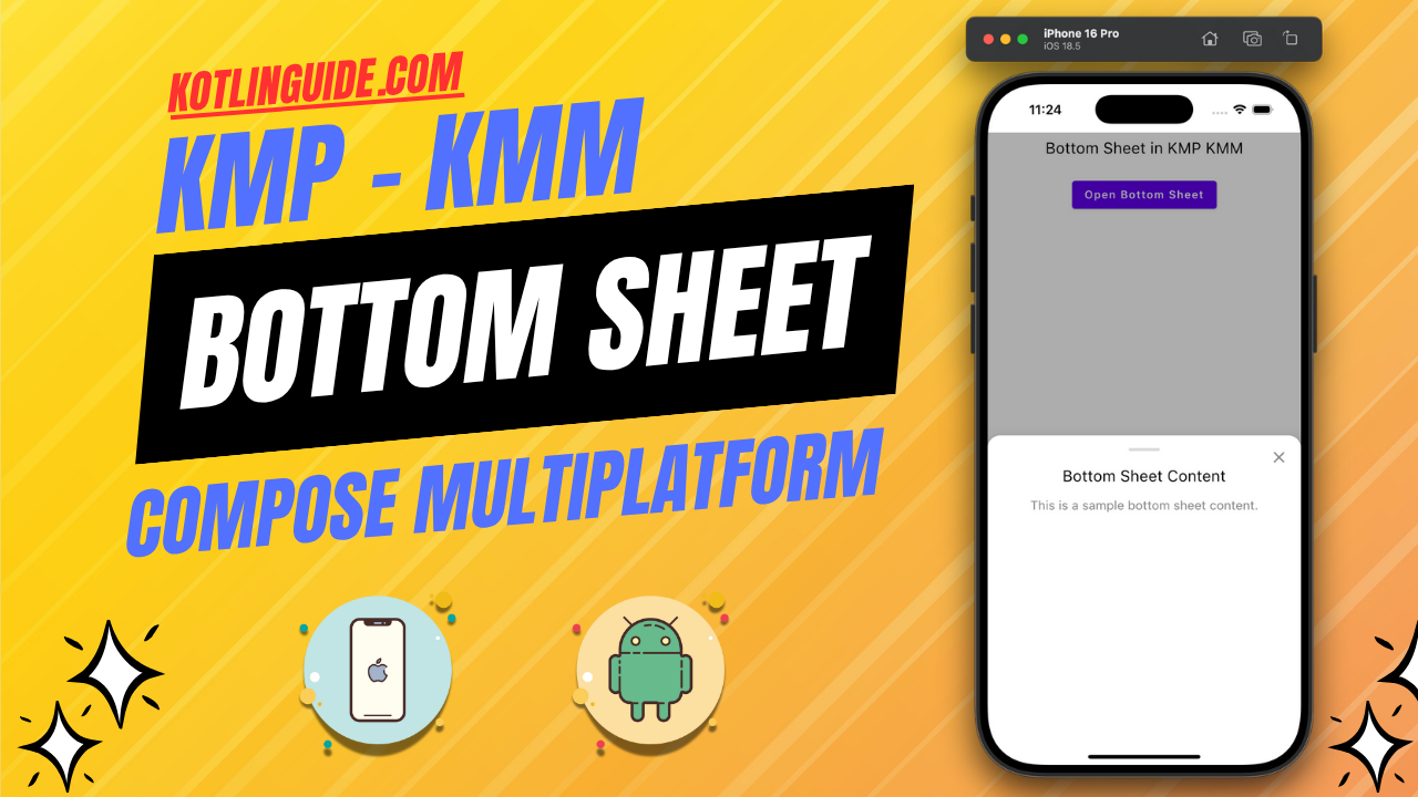
Bottom Sheet in KMP KMM Compose Multiplatform:
Bottom Sheets are a major UI component in mobile applications. The bottom sheet can contain any element and slide from the bottom of the mobile screen to the top using the Slide animation. Bottom sheets are used to add additional information to the current screen without increasing its size. When the user clicks on a button or icon, we trigger the bottom sheet, which appears from the bottom of the device screen and contains all the additional information. It also maintains the application context.
Start coding for the app:
1. Creating a rememberModalBottomSheetState: It is used to show and hide the bottom sheet. We will set its default value as ModalBottomSheetValue.Hidden, which means the bottom sheet will be hidden by default when the screen loads.
|
1 2 3 |
val modalBottomSheetState = rememberModalBottomSheetState( initialValue = ModalBottomSheetValue.Hidden ) |
2. Creating rememberCoroutineScope(): Will help us manage asynchronous tasks. It is required to show and hide the bottom sheet.
|
1 |
val scope = rememberCoroutineScope() |
3. Model Bottom Sheet Layout:
|
1 2 3 4 5 6 7 8 |
ModalBottomSheetLayout( sheetState = modalBottomSheetState, sheetShape = RoundedCornerShape(topStart = 16.dp, topEnd = 16.dp), sheetBackgroundColor = Color.White, sheetContent = { // Content of the Bottom Sheet } ) |
Code explanation:
- sheetState: Links the Bottom Sheet state (Hidden, Expanded).
- sheetShape: Defines the rounded corners for the Bottom Sheet, Top Left, and Top Right.
- sheetBackgroundColor: Sets the background color for the sheet.
- sheetContent: Contains the content of the Bottom Sheet.
4. Designing the drag handle of the Bottom Sheet:
|
1 2 3 4 5 6 7 8 9 |
Box( modifier = Modifier .width(40.dp) .height(4.dp) .background( color = Color.Gray.copy(alpha = 0.3f), shape = RoundedCornerShape(2.dp) ) ) |
It is a small view that is presented at the top of the bottom sheet.
5. Implementing the Close Icon Button of the Bottom Sheet:
It is present at the top right side of the bottom sheet. On button click, we are changing the bottom sheet state to modalBottomSheetState.hide() to hide the bottom sheet.
|
1 2 3 4 5 6 7 8 9 10 11 12 13 |
Icon( imageVector = Icons.Default.Close, contentDescription = "Close", modifier = Modifier .align(Alignment.TopEnd) .padding(16.dp) .clickable { scope.launch { modalBottomSheetState.hide() } }, tint = Color.Gray ) |
6. Adding content in the Bottom Sheet:
|
1 2 3 4 5 6 7 8 9 10 11 12 13 14 15 16 17 18 19 20 21 22 23 |
Column( modifier = Modifier .fillMaxWidth() .padding(16.dp), horizontalAlignment = Alignment.CenterHorizontally ) { Text( "Bottom Sheet Content", style = TextStyle( fontSize = 20.sp, color = Color.Black ) ) Spacer(modifier = Modifier.height(16.dp)) Text( "This is a sample bottom sheet content.", style = TextStyle( fontSize = 16.sp, color = Color.Gray ), textAlign = TextAlign.Center ) } |
For now, as per the tutorial’s purpose, I am only adding 2 Text components in the Bottom Sheet. You can put any element as per your requirement.
7. Creating a button to show the Bottom Sheet:
|
1 2 3 4 5 6 7 8 9 |
Button( onClick = { scope.launch { modalBottomSheetState.show() } } ) { Text("Open Bottom Sheet") } |
On the button click event, we set the State value to modalBottomSheetState.show(), which shows the bottom sheet.
Complete source code of App.kt file:
|
1 2 3 4 5 6 7 8 9 10 11 12 13 14 15 16 17 18 19 20 21 22 23 24 25 26 27 28 29 30 31 32 33 34 35 36 37 38 39 40 41 42 43 44 45 46 47 48 49 50 51 52 53 54 55 56 57 58 59 60 61 62 63 64 65 66 67 68 69 70 71 72 73 74 75 76 77 78 79 80 81 82 83 84 85 86 87 88 89 90 91 92 93 94 95 96 97 98 99 100 101 102 103 104 105 106 107 108 109 110 111 112 113 114 115 116 117 118 119 120 121 122 123 124 125 |
package com.app.test import androidx.compose.foundation.background import androidx.compose.foundation.clickable import androidx.compose.foundation.layout.* import androidx.compose.foundation.shape.RoundedCornerShape import androidx.compose.material.* import androidx.compose.material.icons.Icons import androidx.compose.material.icons.filled.Close import androidx.compose.runtime.* import androidx.compose.ui.Modifier import androidx.compose.ui.Alignment import androidx.compose.ui.graphics.Color import androidx.compose.ui.text.TextStyle import androidx.compose.ui.text.style.TextAlign import androidx.compose.ui.unit.dp import androidx.compose.ui.unit.sp import kotlinx.coroutines.launch @Composable fun App() { val modalBottomSheetState = rememberModalBottomSheetState( initialValue = ModalBottomSheetValue.Hidden ) val scope = rememberCoroutineScope() MaterialTheme { ModalBottomSheetLayout( sheetState = modalBottomSheetState, sheetShape = RoundedCornerShape(topStart = 16.dp, topEnd = 16.dp), sheetBackgroundColor = Color.White, sheetContent = { Box( modifier = Modifier .fillMaxWidth() .height(400.dp) .navigationBarsPadding() ) { // Close Icon Icon( imageVector = Icons.Default.Close, contentDescription = "Close", modifier = Modifier .align(Alignment.TopEnd) .padding(16.dp) .clickable { scope.launch { modalBottomSheetState.hide() } }, tint = Color.Gray ) // Content Column Column( modifier = Modifier .fillMaxWidth() .padding(16.dp), horizontalAlignment = Alignment.CenterHorizontally ) { // Drag Handle Box( modifier = Modifier .width(40.dp) .height(4.dp) .background( color = Color.Gray.copy(alpha = 0.3f), shape = RoundedCornerShape(2.dp) ) ) Spacer(modifier = Modifier.height(20.dp)) Text( "Bottom Sheet Content", style = TextStyle( fontSize = 20.sp, color = Color.Black ) ) Spacer(modifier = Modifier.height(16.dp)) Text( "This is a sample bottom sheet content.", style = TextStyle( fontSize = 16.sp, color = Color.Gray ), textAlign = TextAlign.Center ) } } } ) { // Main Content Column( modifier = Modifier .fillMaxSize() .padding(8.dp), verticalArrangement = Arrangement.Top, horizontalAlignment = Alignment.CenterHorizontally ) { Text( "Bottom Sheet in KMP KMM", modifier = Modifier.fillMaxWidth(), style = TextStyle(color = Color.Black, fontSize = 20.sp), textAlign = TextAlign.Center ) Spacer(Modifier.height(24.dp)) Button( onClick = { scope.launch { modalBottomSheetState.show() } } ) { Text("Open Bottom Sheet") } } } } } |
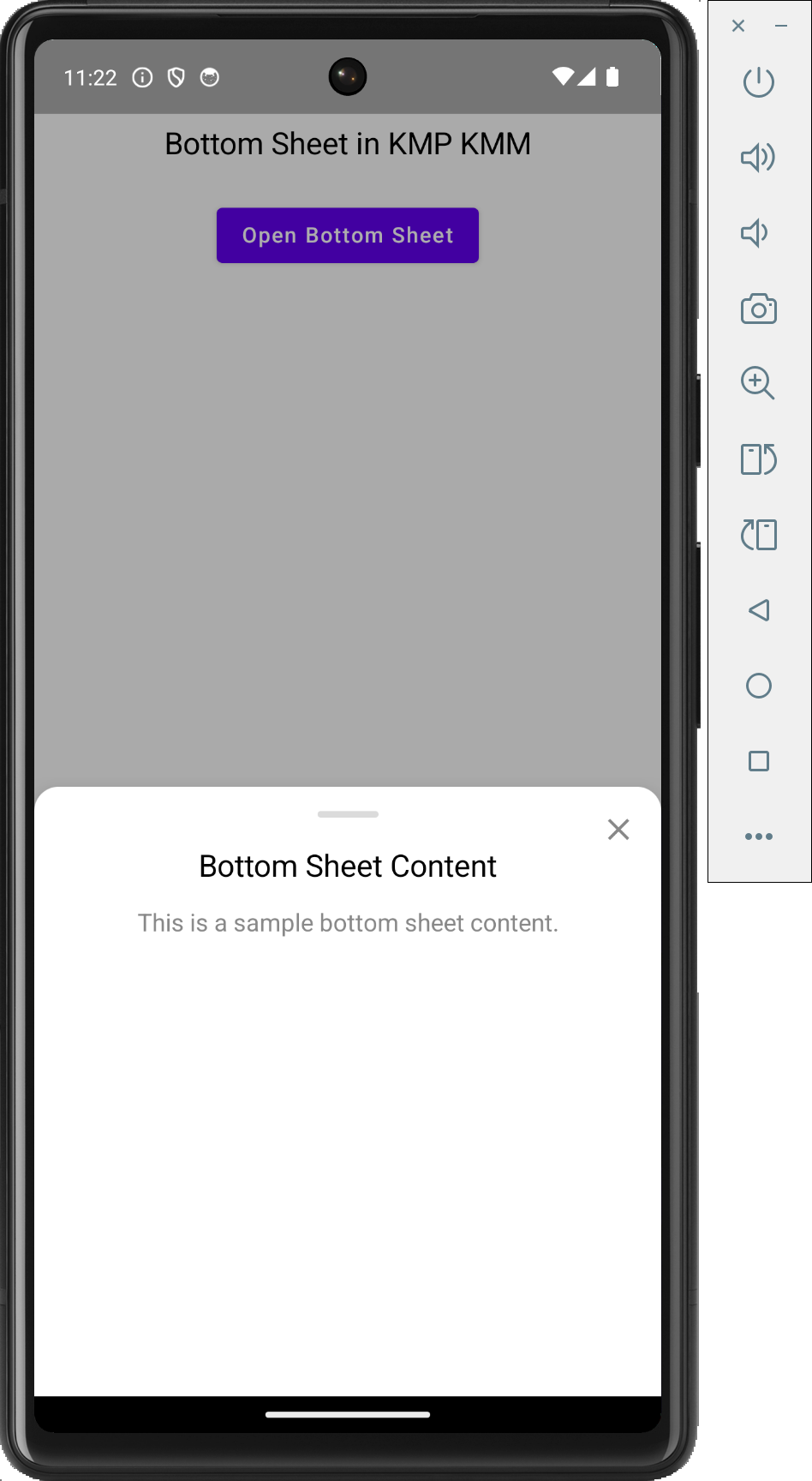
Screenshot on an Android device:
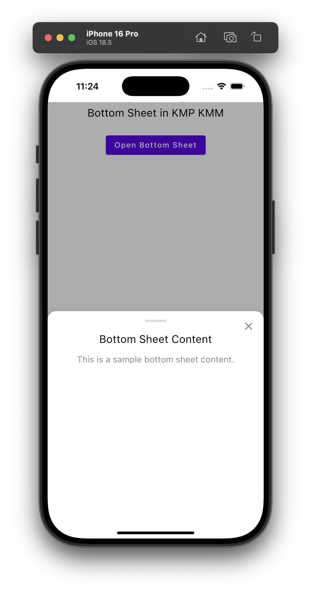
Screenshot on an iOS device:

Hello friend, thanks for sharing your knowledge :), could you share the iOS code?
Denis This is the common main code , It works for both Android & iOS .
Thanks, friend 🙂 I didn’t know about KMP, hehe. Cheers!