In today’s tutorial, we will learn how to create an Alert Dialog in Kotlin Compose Multiplatform KMP KMM for Android & iOS platforms. This is a step-by-step guide to implementing an alert dialog in a cross-platform UI, including functionality.
Alert Dialog in Kotlin Compose Multiplatform KMP KMM:
An Alert Dialog is a special type of dialog that interrupts the user flow to provide crucial information or prompt a special decision. It consists of a Title, a message, and can have one or more buttons to accept or reject a decision. Its primary purpose is to capture the mobile user’s immediate attention for a specific task.
Creating a Simple Alert Dialog:
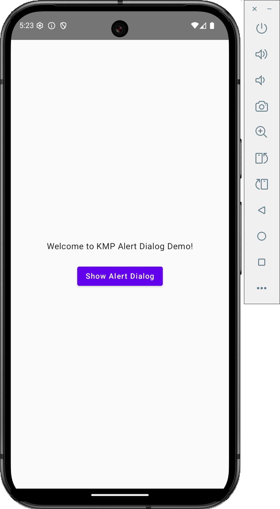
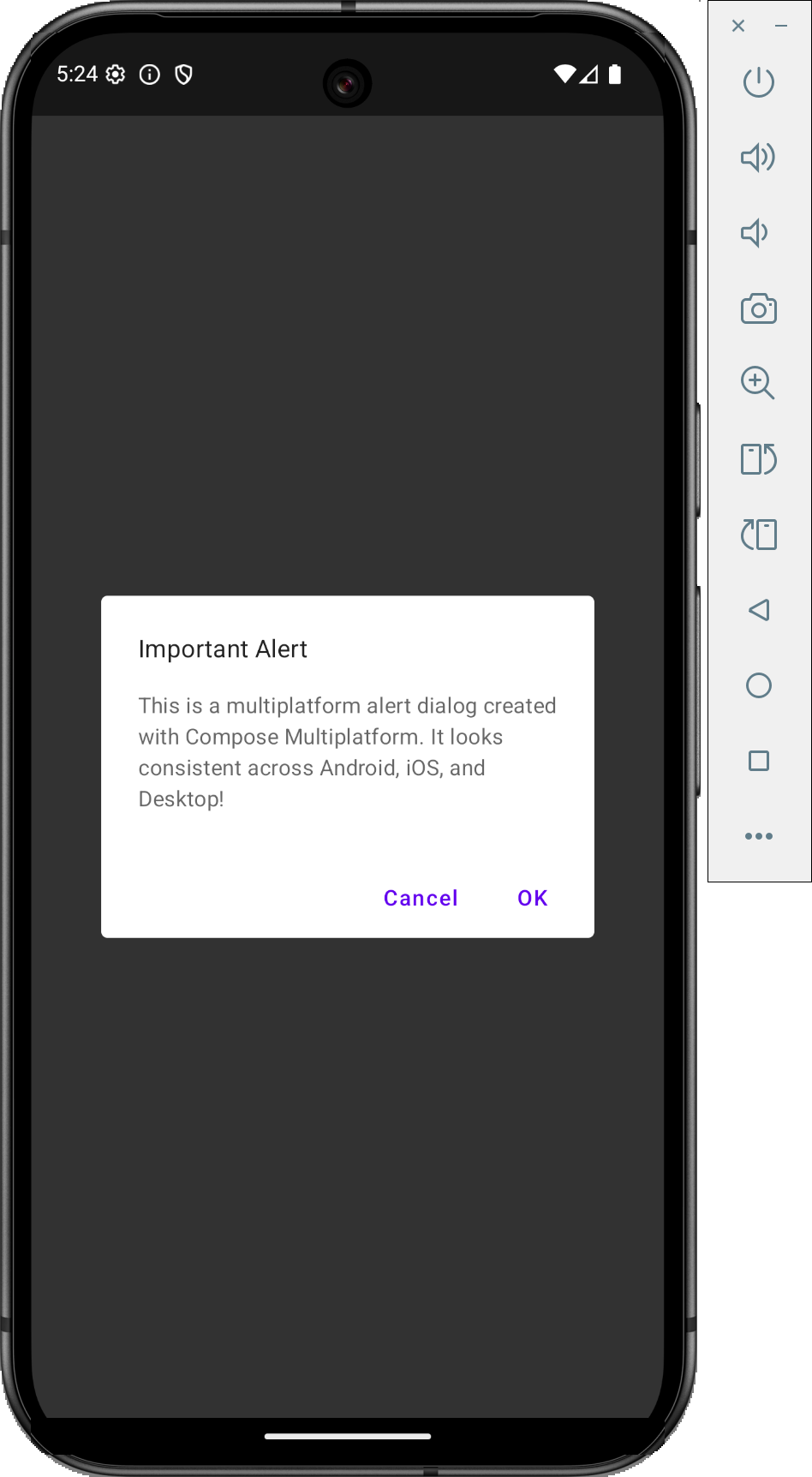
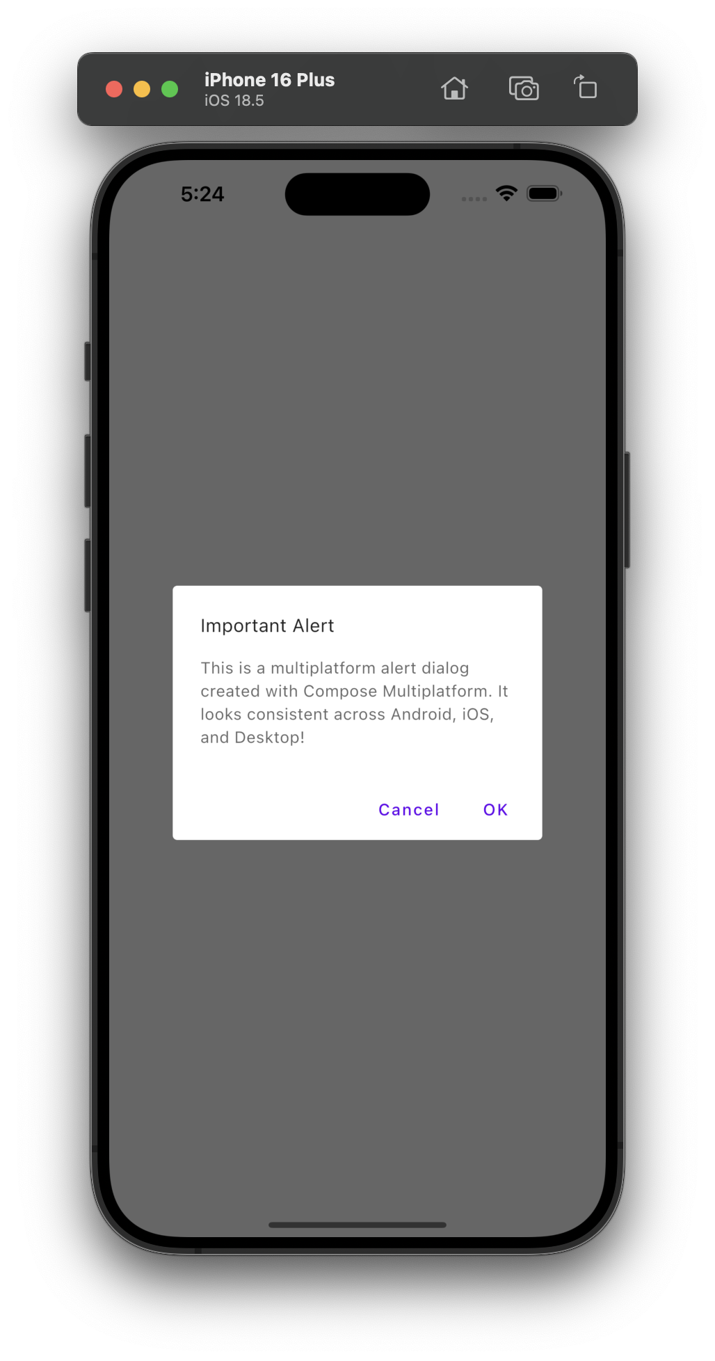
First of all, we are creating the simplest alert dialog, which we have seen in many mobile or web applications. This alert dialog contains a Title, description, and yes and no buttons.
|
1 2 3 4 5 6 7 8 9 10 11 12 13 14 15 16 17 18 19 20 21 22 23 24 25 26 27 28 29 30 31 32 33 34 35 36 37 38 39 40 41 42 43 44 45 46 47 48 49 50 51 52 53 54 55 56 57 58 59 60 61 62 63 64 65 66 67 68 69 70 71 72 73 |
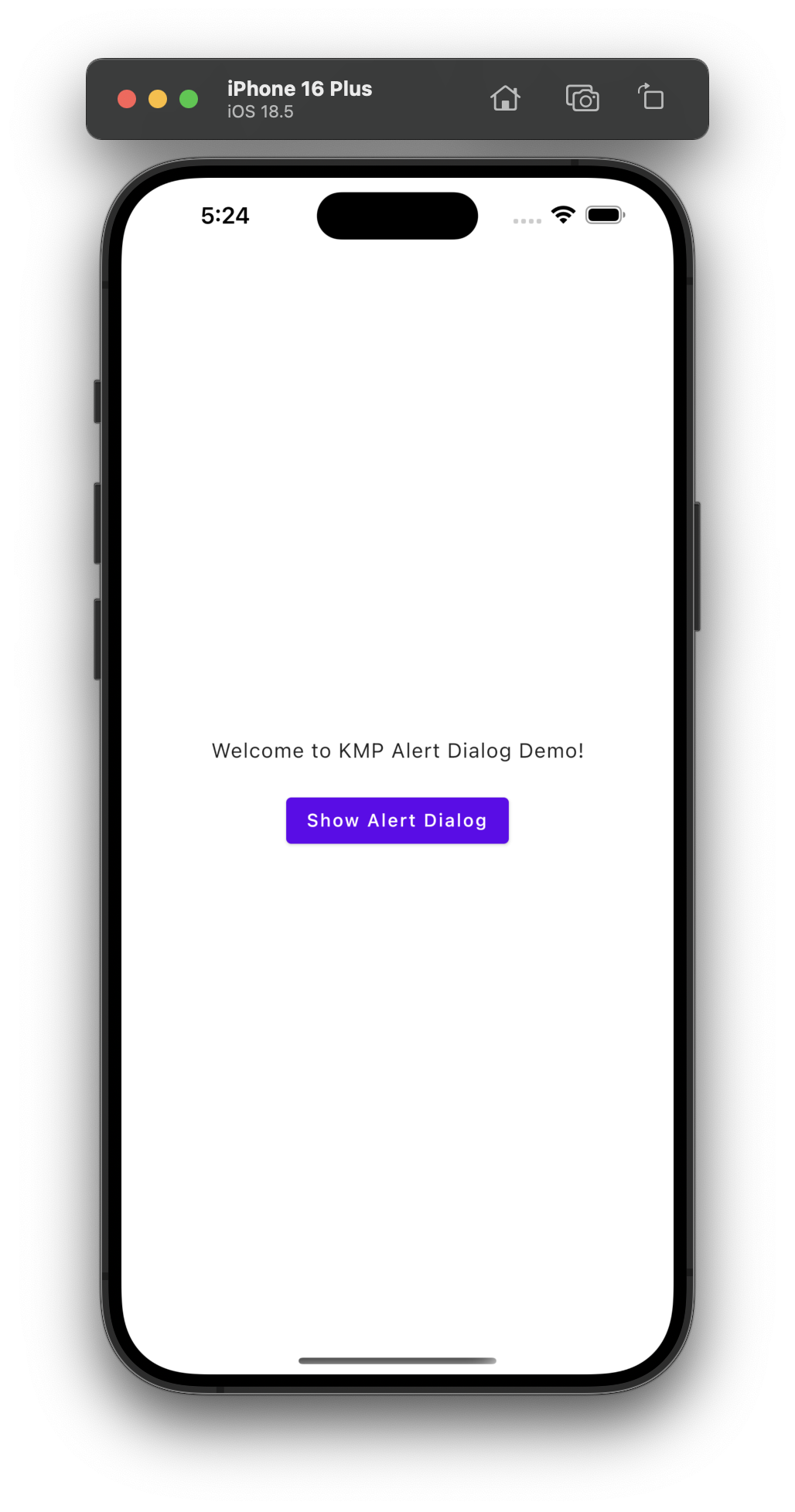
package com.app.test import androidx.compose.foundation.layout.Arrangement import androidx.compose.foundation.layout.Column import androidx.compose.foundation.layout.Spacer import androidx.compose.foundation.layout.fillMaxSize import androidx.compose.foundation.layout.height import androidx.compose.foundation.layout.padding import androidx.compose.material.AlertDialog import androidx.compose.material.Button import androidx.compose.material.MaterialTheme import androidx.compose.material.Text import androidx.compose.material.TextButton import androidx.compose.runtime.Composable import androidx.compose.runtime.getValue import androidx.compose.runtime.mutableStateOf import androidx.compose.runtime.remember import androidx.compose.runtime.setValue import androidx.compose.ui.Alignment import androidx.compose.ui.Modifier import androidx.compose.ui.unit.dp @Composable fun App() { MaterialTheme { var showAlertDialog by remember { mutableStateOf(false) } Column( modifier = Modifier.fillMaxSize().padding(16.dp), horizontalAlignment = Alignment.CenterHorizontally, verticalArrangement = Arrangement.Center ) { Text("Welcome to KMP Alert Dialog Demo!") Spacer(Modifier.height(20.dp)) Button(onClick = { showAlertDialog = true }) { Text("Show Alert Dialog") } if (showAlertDialog) { AlertDialog( onDismissRequest = { showAlertDialog = false }, title = { Text("Important Alert") }, text = { Text("This is a multiplatform alert dialog created with Compose Multiplatform. It looks consistent across Android, iOS, and Desktop!") }, confirmButton = { TextButton( onClick = { showAlertDialog = false println("Confirmed!") } ) { Text("OK") } }, dismissButton = { TextButton( onClick = { showAlertDialog = false println("Cancelled!") } ) { Text("Cancel") } } ) } } } } |
Code explanation:
- AlertDialog: The AlertDialog composable is used to display a standard Material Design dialog. This dialog contains a title, body text, and buttons for user interaction.
- onDismissRequest: This is triggered when the user dismisses the dialog (e.g., clicking outside the dialog or pressing the back button). It sets showAlertDialog to false to hide the dialog.
- title: A composable that displays the title of the dialog, in this case, “Important Alert”.
- text: A composable that displays the body text of the dialog, which informs the user that the dialog was created with Kotlin Multiplatform.
- onfirmButton: A button inside the dialog, which the user clicks to confirm the dialog. In this case, it closes the dialog (showAlertDialog = false) and prints “Confirmed!” in the console.
- dismissButton: A button that cancels the action and dismisses the dialog. It also sets showAlertDialog to false and prints “Cancelled!” to the console.
- remember and mutableStateOf: remember is used to store and remember a state variable across recompositions of the Composable. mutableStateOf(false) creates a mutable state variable showAlertDialog and initializes it to false. This variable is used to control the visibility of the AlertDialog. When showAlertDialog is true, the AlertDialog becomes visible.
Screenshot on an Android device:
Screenshot on an iOS device:
Creating an Alert Dialog:
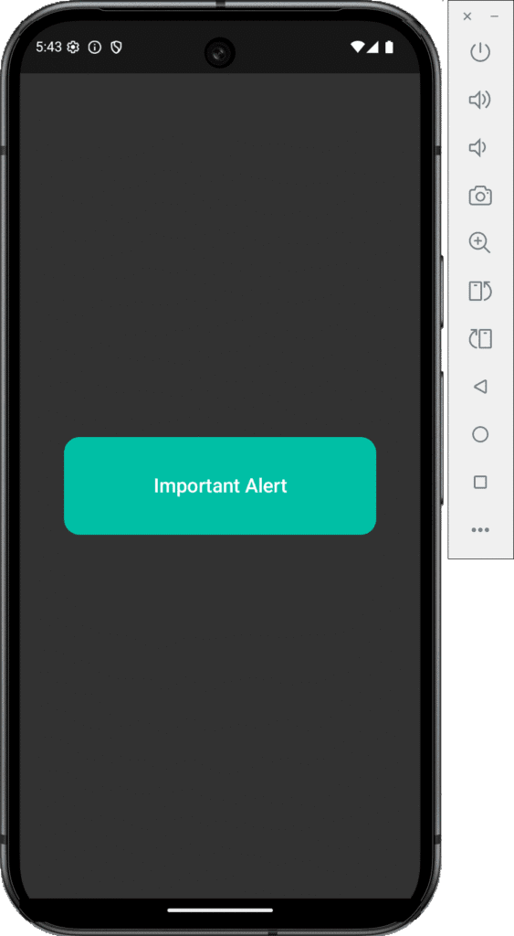
We are creating an alert with only a Title text.
|
1 2 3 4 5 6 7 8 9 10 11 12 13 14 15 16 17 18 19 20 21 22 23 24 25 26 27 28 29 30 31 32 33 34 35 36 37 38 39 40 41 42 43 44 45 46 47 48 49 50 51 52 53 54 55 56 57 |
package com.app.test import androidx.compose.foundation.background import androidx.compose.foundation.layout.* import androidx.compose.material.* import androidx.compose.runtime.* import androidx.compose.ui.Alignment import androidx.compose.ui.Modifier import androidx.compose.ui.graphics.Color import androidx.compose.ui.unit.dp import androidx.compose.ui.window.Dialog import androidx.compose.ui.draw.clip import androidx.compose.foundation.shape.RoundedCornerShape import androidx.compose.ui.text.style.TextAlign @Composable fun App() { MaterialTheme { var showAlertDialog by remember { mutableStateOf(false) } Column( modifier = Modifier .fillMaxSize() .padding(16.dp), horizontalAlignment = Alignment.CenterHorizontally, verticalArrangement = Arrangement.Center ) { Text("Welcome to KMP Alert Dialog Demo!") Spacer(Modifier.height(20.dp)) Button(onClick = { showAlertDialog = true }) { Text("Show Custom Alert Dialog") } // Custom Alert Dialog UI if (showAlertDialog) { Dialog(onDismissRequest = { showAlertDialog = false }) { Box( modifier = Modifier .fillMaxWidth() .height(100.dp) .clip(RoundedCornerShape(16.dp)) // Rounded edges .background(Color(0xFF00BFA5)) // Light Blue background .padding(24.dp), contentAlignment = Alignment.Center ) { Text( text = "Important Alert", style = MaterialTheme.typography.h6, color = Color.White, textAlign = TextAlign.Center ) } } } } } } |
Screenshot on an iOS device & Android device:

Code explanation:
- remember and mutableStateOf: remember is used to store state across recompositions of composables, while mutableStateOf(false) initializes a mutable state variable showAlertDialog with a default value of false.
- showAlertDialog tracks the visibility of the custom alert dialog. When true, the dialog is shown; when false, the dialog is hidden.
- Dialog: Dialog is used to display a custom dialog UI. It is similar to AlertDialog but allows for more customization.
- onDismissRequest: This lambda is called when the dialog is dismissed. It sets showAlertDialog to false, which hides the dialog when the user clicks outside or on the back button.
- Box: Box is a composable that allows you to stack other composables on top of each other. It provides a flexible layout where you can use content alignment and padding effectively.
- fillMaxWidth(): Makes the Box take up the full available width in its parent container.
- height(100.dp): Sets the height of the Box to 100 dp.
- clip(RoundedCornerShape(16.dp)): Clips the content of the Box to have rounded corners with a radius of 16 dp.
- background(Color(0xFF00BFA5)): Sets the background color of the Box to a light blue color using a hex color code.
- padding(24.dp): Adds padding inside the Box around its child content (the Text composable).
- contentAlignment = Alignment.Center: Aligns the child content (the Text composable) to the center of the Box.
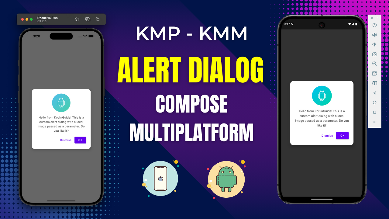
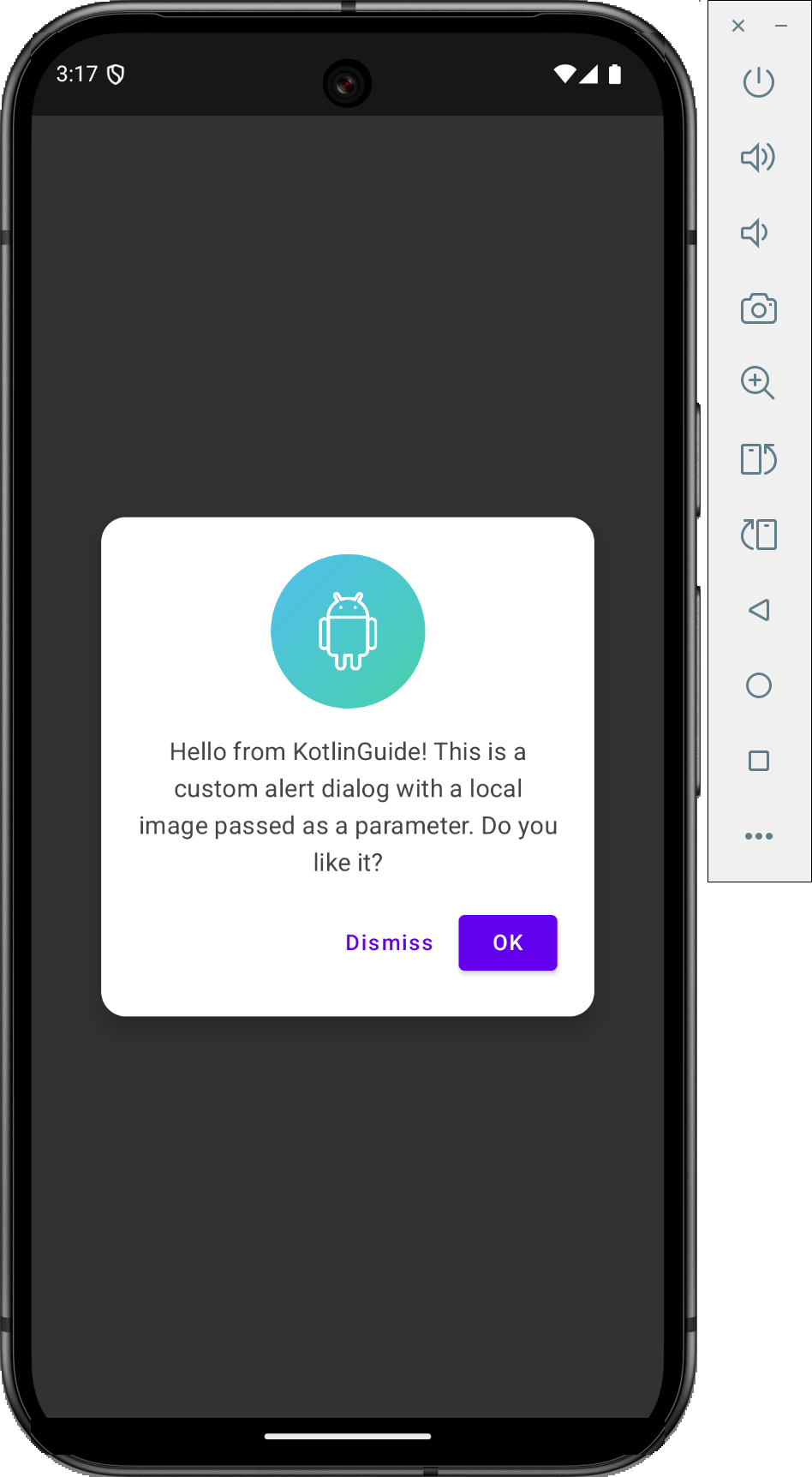
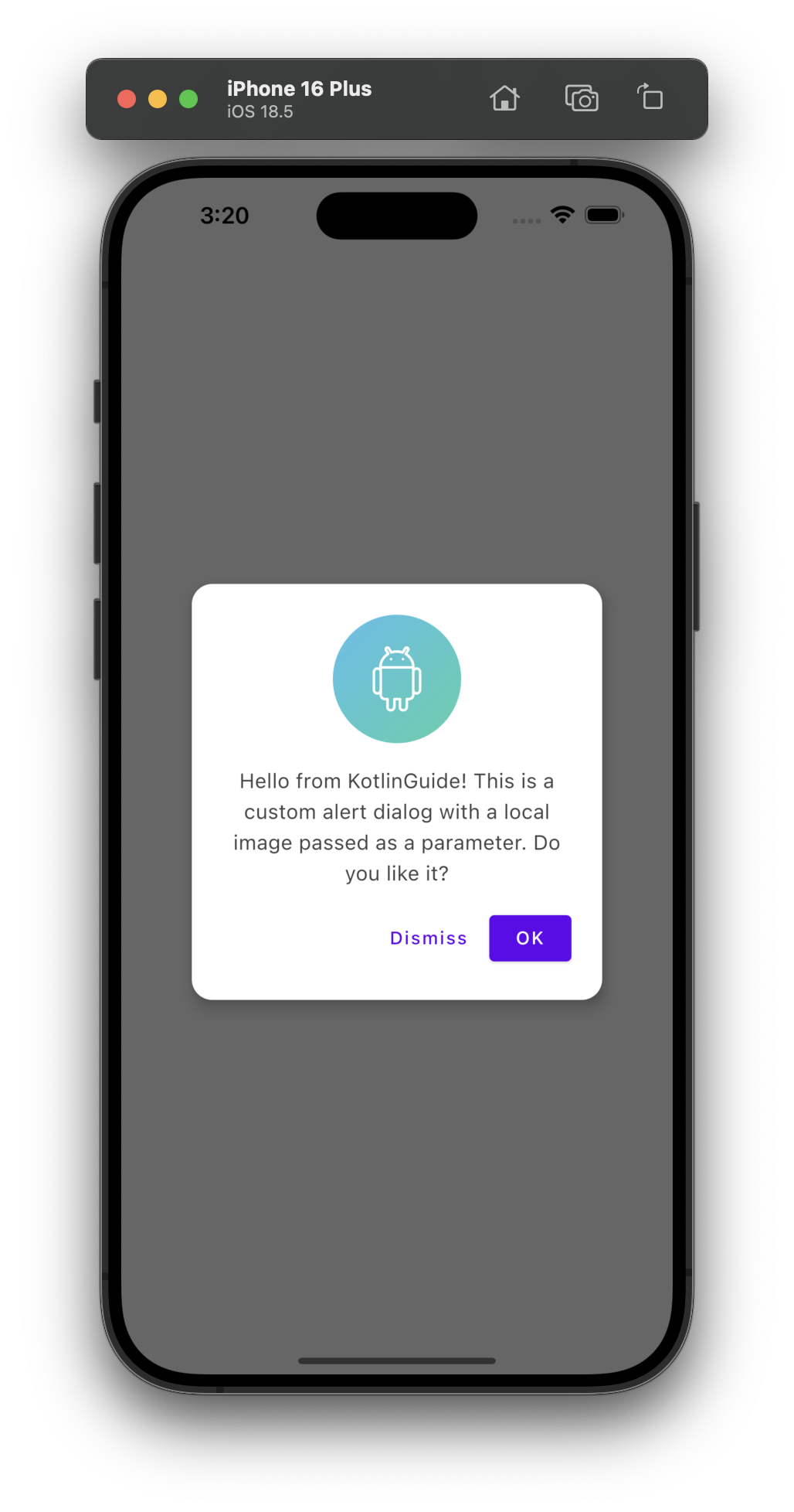
Alert Dialog in Kotlin Compose Multiplatform KMP KMM with Image:
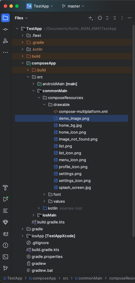
1. We are creating an Alert Dialog with an Image. The image is put inside the
composeApp -> commonMain -> composeResource -> drawable folder.
After putting the image in, make sure to sync your project.
Code for App.kt file:
|
1 2 3 4 5 6 7 8 9 10 11 12 13 14 15 16 17 18 19 20 21 22 23 24 25 26 27 28 29 30 31 32 33 34 35 36 37 38 39 40 41 42 43 44 45 46 47 48 49 50 51 52 53 54 55 56 57 58 59 60 61 62 63 64 65 66 67 68 69 70 71 72 73 74 75 76 77 78 79 80 81 82 83 84 85 86 87 88 89 90 91 92 93 94 95 96 97 98 99 100 101 102 103 104 105 106 107 108 109 110 111 112 113 114 115 116 117 118 119 120 121 122 123 124 125 |
package com.app.test import androidx.compose.foundation.Image import androidx.compose.foundation.layout.* import androidx.compose.foundation.shape.CircleShape import androidx.compose.material.* import androidx.compose.runtime.* import androidx.compose.ui.Alignment import androidx.compose.ui.Modifier import androidx.compose.ui.graphics.Color import androidx.compose.ui.unit.dp import androidx.compose.ui.window.Dialog import androidx.compose.ui.draw.clip import androidx.compose.foundation.shape.RoundedCornerShape import androidx.compose.ui.layout.ContentScale import androidx.compose.ui.text.style.TextAlign import org.jetbrains.compose.resources.painterResource import org.jetbrains.compose.resources.DrawableResource import testapp.composeapp.generated.resources.Res import testapp.composeapp.generated.resources.demo_image @Composable fun App() { MaterialTheme { var showCustomAlertDialog by remember { mutableStateOf(false) } Column( modifier = Modifier .fillMaxSize() .padding(16.dp), horizontalAlignment = Alignment.CenterHorizontally, verticalArrangement = Arrangement.Center ) { Text("Welcome to KMP Alert Dialog Demo!") Spacer(Modifier.height(20.dp)) Button(onClick = { showCustomAlertDialog = true }) { Text("Show Custom Alert Dialog") } MyCustomAlertDialog( showDialog = showCustomAlertDialog, onDismiss = { showCustomAlertDialog = false }, onConfirm = { println("OK button clicked!") showCustomAlertDialog = false }, imageRes = Res.drawable.demo_image, message = "Hello from KotlinGuide! This is a custom alert dialog with a local image passed as a parameter. Do you like it?" ) } } } /** * Reusable Composable for a custom alert dialog with a local image, message, and action buttons. * * @param showDialog State to control the dialog's visibility. * @param onDismiss Lambda to be invoked when the dialog should be dismissed (e.g., user clicks outside, dismiss button). * @param onConfirm Lambda to be invoked when the confirm (OK) button is clicked. * @param imageRes The local [DrawableResource] to display at the top of the dialog. * @param message The main text message to display in the dialog. */ @Composable fun MyCustomAlertDialog( showDialog: Boolean, onDismiss: () -> Unit, onConfirm: () -> Unit, imageRes: DrawableResource, message: String ) { if (showDialog) { Dialog(onDismissRequest = onDismiss) { Surface( modifier = Modifier .fillMaxWidth() .wrapContentHeight(), shape = RoundedCornerShape(16.dp), color = Color.White, elevation = 8.dp ) { Column( modifier = Modifier .padding(24.dp) .fillMaxWidth(), horizontalAlignment = Alignment.CenterHorizontally, verticalArrangement = Arrangement.spacedBy(16.dp) ) { Image( painter = painterResource(imageRes), contentDescription = "Custom Alert Image", contentScale = ContentScale.Crop, modifier = Modifier .size(100.dp) .clip(CircleShape) ) Text( text = message, textAlign = TextAlign.Center, style = MaterialTheme.typography.subtitle1, color = Color.DarkGray ) Row( modifier = Modifier.fillMaxWidth(), horizontalArrangement = Arrangement.End ) { TextButton( onClick = onDismiss, colors = ButtonDefaults.textButtonColors(contentColor = MaterialTheme.colors.primary) ) { Text("Dismiss") } Spacer(Modifier.width(8.dp)) Button( onClick = onConfirm ) { Text("OK") } } } } } } } |
Code explanation:
- MaterialTheme: The MaterialTheme composable applies Material Design styling to all child composables inside it. It ensures that the UI components like text, buttons, and dialogs follow the Material Design guidelines for consistent styling (colors, typography, shapes, etc.).
- remember and mutableStateOf: remember stores the state of showCustomAlertDialog across recompositions, preserving the value of the state variable. mutableStateOf(false) initializes the showCustomAlertDialog variable with false, meaning the dialog is initially hidden. Changing it to true will show the dialog.
- Column: The Column composable arranges its children vertically in a column layout.
- Modifiers: fillMaxSize(): Ensures that the column takes up all available space.
- padding(16.dp): Adds padding of 16 dp around the column for proper spacing.
- horizontalAlignment = Alignment.CenterHorizontally: Centers the children horizontally.
- verticalArrangement = Arrangement.Center: Centers the children vertically within the column.
- MyCustomAlertDialog: A custom composable for displaying an alert dialog. Accepts parameters to control the dialog’s visibility (showDialog), dismissal action (onDismiss), confirmation action (onConfirm), image resource (imageRes), and message text (message).
- Dialog: A composable that shows a modal dialog on the screen.
- onDismissRequest: A callback triggered when the user dismisses the dialog, either by clicking outside or pressing the back button.
- Surface: Surface defines the background of the dialog and handles elevation, shape, and color.
- fillMaxWidth(): Ensures the surface takes up the full available width.
- wrapContentHeight(): Makes the height of the surface adjust to fit its content.
- shape = RoundedCornerShape(16.dp): Rounds the corners of the dialog with a 16 dp radius.
- color = Color.White: Sets the background color to white.
- elevation = 8.dp: Adds a shadow effect with 8 dp elevation, making the dialog appear elevated above other UI elements.
- Image: Displays the image passed as a parameter (imageRes) in the dialog.
- size(100.dp): Sets the size of the image to 100 dp.
- clip(CircleShape): Clips the image into a circular shape using CircleShape.
- contentScale = ContentScale.Crop: Ensures the image is cropped to fit the circle shape.
- contentDescription = “Custom Alert Image”: Provides an accessibility description for the image.
Screenshot on an Android device:
Screenshot on an iOS device: