In today’s tutorial, we will learn how to implement a Material Drop Down Menu in Kotlin Compose Multiplatform (KMP, KMM) for Android, iOS, web, and desktop platforms. Follow all the steps in the tutorial with code to integrate a cross-platform drop-down component.
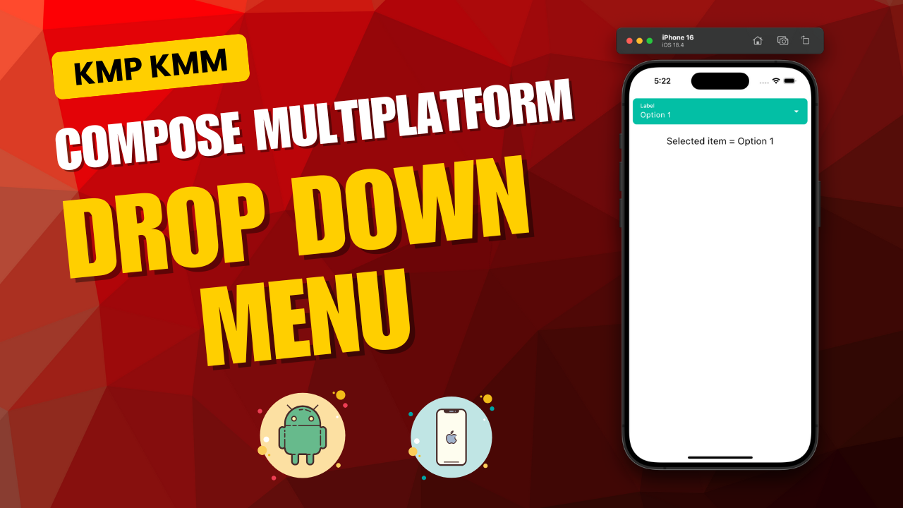
Drop Down Menu in Kotlin Compose Multiplatform (KMP, KMM):
Drop-down menus are essential UI components for selecting a single value from multiple options. It is a dynamic content popup that shows a list of items within. It saves space on screen because a single item contains multiple data. In Kotlin Compose Multiplatform, we will be using ExposedDropdownMenuBox and ExposedDropdownMenu with the combination of TextField to creating beautiful material style drop down menu.
Start coding:
1. Creating a custom variable options to store drop-down menu items.
|
1 |
val options = listOf("Option 1", "Option 2", "Option 3", "Option 4", "Option 5") |
2. Creating a State named expanded to detect whether the drop-down menu is open or closed state.
|
1 |
var expanded by remember { mutableStateOf(false) } |
3. Creating a State named selectedOption to set the default item on app startup, then to hold the drop-down selected item.
|
1 |
var selectedOption by remember { mutableStateOf(options[0]) } |
4. Creating ExposedDropdownMenuBox component. This is our main drop-down menu container.
|
1 2 3 4 5 6 7 8 |
ExposedDropdownMenuBox( expanded = expanded, onExpandedChange = { expanded = it }, //modifier = Modifier.background(Color(0xff00BFA5)), ) { } |
expanded: This is the expanded state, which controls the drop-down open and close state.
5. Creating TextField component. It is the main component that shows on the screen when the drop-down menu is closed.
|
1 2 3 4 5 6 7 8 9 10 11 12 13 14 15 16 17 18 19 20 21 22 23 24 25 26 27 28 29 30 |
TextField( value = selectedOption, onValueChange = {}, modifier = Modifier.fillMaxWidth(), readOnly = true, label = { Text( "Label", style = TextStyle(color = Color.White, fontSize = 12.sp) ) }, trailingIcon = { Icon( imageVector = Icons.Filled.ArrowDropDown, contentDescription = if (expanded) "Collapse" else "Expand", modifier = Modifier.rotate(if (expanded) 180f else 0f), tint = Color.White , ) }, colors = ExposedDropdownMenuDefaults.textFieldColors( textColor = Color.White, backgroundColor = Color(0xff00BFA5), cursorColor = Color.White, focusedIndicatorColor = Color.Transparent, unfocusedIndicatorColor = Color.Transparent, disabledIndicatorColor = Color.Transparent ), singleLine = true, shape = RoundedCornerShape(8.dp) ) |
Code explanation:
- value = selectedOption – Sets the current text shown in the field (i.e., selected dropdown item).
- onValueChange = {} – Disabled input typing as it’s a dropdown, not editable by the user directly.
- modifier = Modifier.fillMaxWidth() – Makes the text field take the full width of its parent.
- readOnly = true – Prevents user from editing text; used to trigger dropdown only.
- label = { Text(…) } – Displays a label above the field for a contextual hint (e.g., “Select item”).
- trailingIcon = { Icon(…) } – Shows dropdown arrow icon and rotates based on expanded state.
- colors = ExposedDropdownMenuDefaults.textFieldColors(…) – Customizes text, background, and indicator colors.
- singleLine = true – Ensures only a single line of text appears in the field.
- shape = RoundedCornerShape(8.dp) – Applies rounded corners with 8dp radius for visual styling.
6. Creating ExposedDropdownMenu component.
|
1 2 3 4 5 6 7 8 9 10 11 12 13 14 15 16 17 18 19 20 21 22 23 24 25 26 27 |
ExposedDropdownMenu( expanded = expanded, onDismissRequest = { expanded = false }, modifier = Modifier.fillMaxWidth().background(Color.White) ) { options.forEachIndexed{index, option -> DropdownMenuItem( onClick = { selectedOption = option expanded = false } ) { Text( option, style = TextStyle(fontSize = 16.sp, color = Color(0xff263238)) ) } // Show divider after every item except the last one if (index < options.lastIndex) { Divider( color = Color.LightGray, thickness = 1.dp, modifier = Modifier.padding(horizontal = 8.dp) ) } } } |
Code explanation:
- ExposedDropdownMenu – A Composable that displays a dropdown list anchored to a text field.
- expanded = expanded – Controls whether the dropdown is visible (true) or hidden (false).
- onDismissRequest = { expanded = false } – Hides the dropdown when clicked outside or dismissed.
- modifier = Modifier.fillMaxWidth().background(Color.White) – Sets full width and white background for the dropdown.
- options.forEachIndexed { index, option -> … } – Loops through each item with its index to display as dropdown options.
- DropdownMenuItem – A clickable item in the dropdown list.
- onClick = { selectedOption = option; expanded = false } – Sets selected item and collapses the dropdown on click.
- Text – Displays the dropdown option’s text.
- style = TextStyle(fontSize = 16.sp, color = Color(0xff263238)) – Sets font size to 16sp and text color to dark gray.
- if (index < options.lastIndex) { Divider(…) } – Adds a light gray line between items except after the last one.
- Divider – Visual separator line between dropdown items.
- color = Color.LightGray – Sets divider line color.
- thickness = 1.dp – Sets the divider’s thickness.
- modifier = Modifier.padding(horizontal = 8.dp) – Adds horizontal padding around the divider.
Complete source code of App.kt file:
|
1 2 3 4 5 6 7 8 9 10 11 12 13 14 15 16 17 18 19 20 21 22 23 24 25 26 27 28 29 30 31 32 33 34 35 36 37 38 39 40 41 42 43 44 45 46 47 48 49 50 51 52 53 54 55 56 57 58 59 60 61 62 63 64 65 66 67 68 69 70 71 72 73 74 75 76 77 78 79 80 81 82 83 84 85 86 87 88 89 90 91 92 93 94 95 96 97 98 99 100 101 102 103 104 105 106 107 108 109 110 111 112 113 114 115 116 117 118 119 120 121 122 123 124 |
package com.app.test import androidx.compose.foundation.background import androidx.compose.foundation.layout.Arrangement import androidx.compose.foundation.layout.Column import androidx.compose.foundation.layout.Spacer import androidx.compose.foundation.layout.fillMaxSize import androidx.compose.material.DropdownMenuItem import androidx.compose.material.ExperimentalMaterialApi import androidx.compose.material.ExposedDropdownMenuBox import androidx.compose.material.ExposedDropdownMenuDefaults import androidx.compose.material.MaterialTheme import androidx.compose.material.Text import androidx.compose.material.TextField import androidx.compose.runtime.Composable import androidx.compose.runtime.getValue import androidx.compose.runtime.mutableStateOf import androidx.compose.runtime.remember import androidx.compose.runtime.setValue import androidx.compose.ui.Modifier import androidx.compose.foundation.layout.fillMaxWidth import androidx.compose.foundation.layout.height import androidx.compose.foundation.layout.padding import androidx.compose.foundation.shape.RoundedCornerShape import androidx.compose.material.Divider import androidx.compose.material.Icon import androidx.compose.material.icons.Icons import androidx.compose.material.icons.filled.ArrowDropDown import androidx.compose.ui.draw.rotate import androidx.compose.ui.graphics.Color import androidx.compose.ui.text.TextStyle import androidx.compose.ui.text.style.TextAlign import androidx.compose.ui.unit.dp import androidx.compose.ui.unit.sp @OptIn(ExperimentalMaterialApi::class) @Composable fun App() { MaterialTheme { val options = listOf("Option 1", "Option 2", "Option 3", "Option 4", "Option 5") var expanded by remember { mutableStateOf(false) } var selectedOption by remember { mutableStateOf(options[0]) } Column( modifier = Modifier .fillMaxSize() .padding(8.dp), verticalArrangement = Arrangement.Top ) { ExposedDropdownMenuBox( expanded = expanded, onExpandedChange = { expanded = it }, //modifier = Modifier.background(Color(0xff00BFA5)), ) { TextField( value = selectedOption, onValueChange = {}, modifier = Modifier.fillMaxWidth(), readOnly = true, label = { Text( "Label", style = TextStyle(color = Color.White, fontSize = 12.sp) ) }, trailingIcon = { Icon( imageVector = Icons.Filled.ArrowDropDown, contentDescription = if (expanded) "Collapse" else "Expand", modifier = Modifier.rotate(if (expanded) 180f else 0f), tint = Color.White , ) }, colors = ExposedDropdownMenuDefaults.textFieldColors( textColor = Color.White, backgroundColor = Color(0xff00BFA5), cursorColor = Color.White, focusedIndicatorColor = Color.Transparent, unfocusedIndicatorColor = Color.Transparent, disabledIndicatorColor = Color.Transparent ), singleLine = true, shape = RoundedCornerShape(8.dp) ) ExposedDropdownMenu( expanded = expanded, onDismissRequest = { expanded = false }, modifier = Modifier.fillMaxWidth().background(Color.White) ) { options.forEachIndexed{index, option -> DropdownMenuItem( onClick = { selectedOption = option expanded = false } ) { Text( option, style = TextStyle(fontSize = 16.sp, color = Color(0xff263238)) ) } // Show divider after every item except the last one if (index < options.lastIndex) { Divider( color = Color.LightGray, thickness = 1.dp, modifier = Modifier.padding(horizontal = 8.dp) ) } } } } Spacer(Modifier.height(24.dp)) Text( "Selected item = $selectedOption", modifier = Modifier.fillMaxWidth(), style = TextStyle(color = Color.Black, fontSize = 20.sp), textAlign = TextAlign.Center ) } } } |
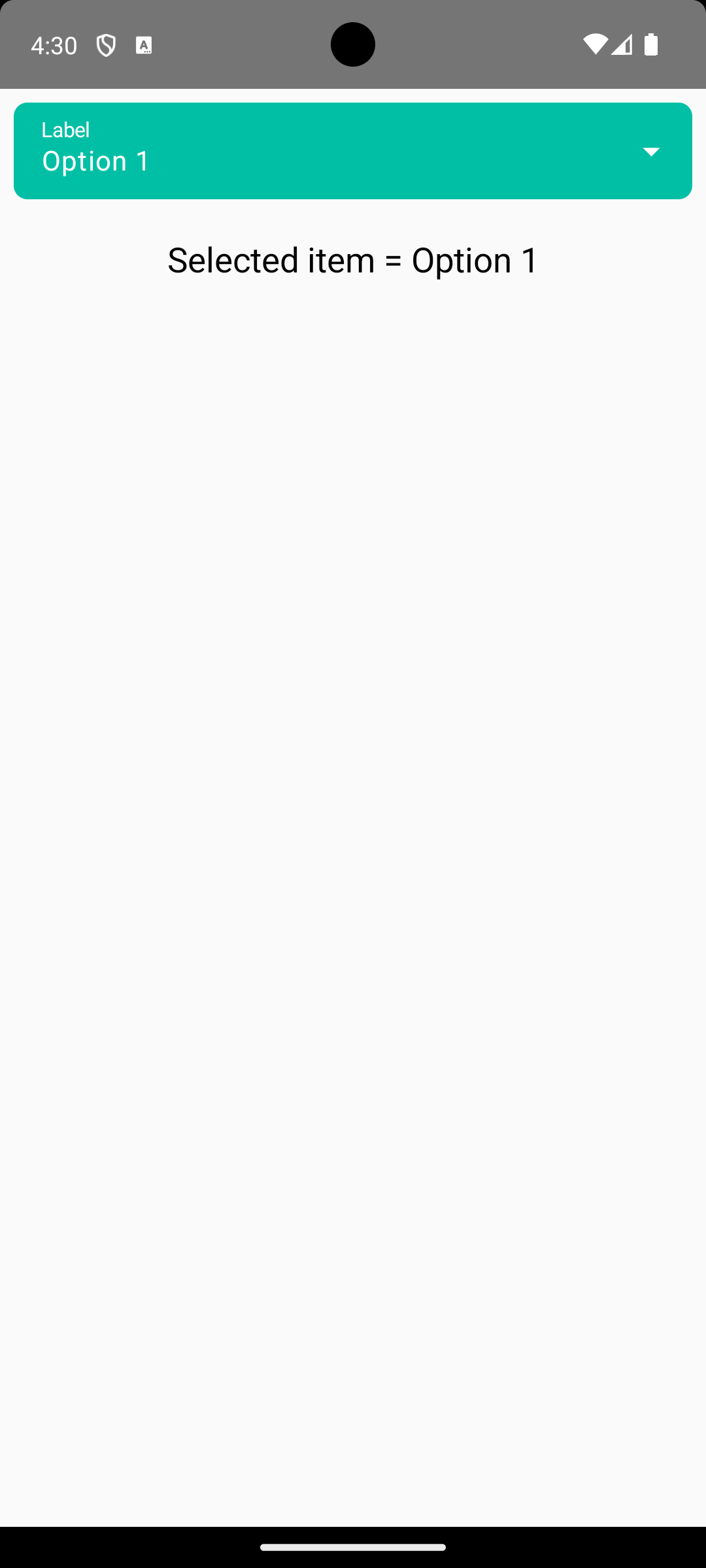
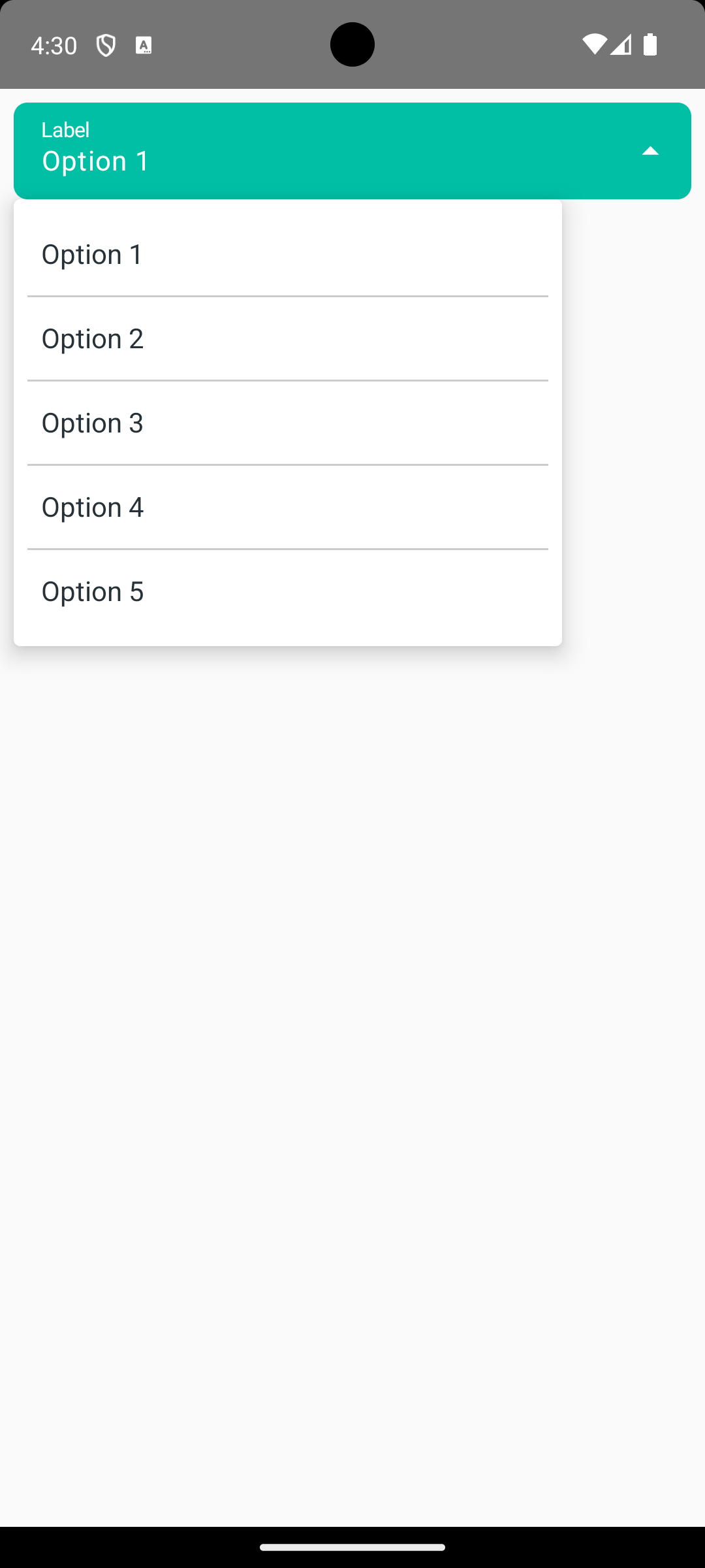
Screenshot on an Android device:
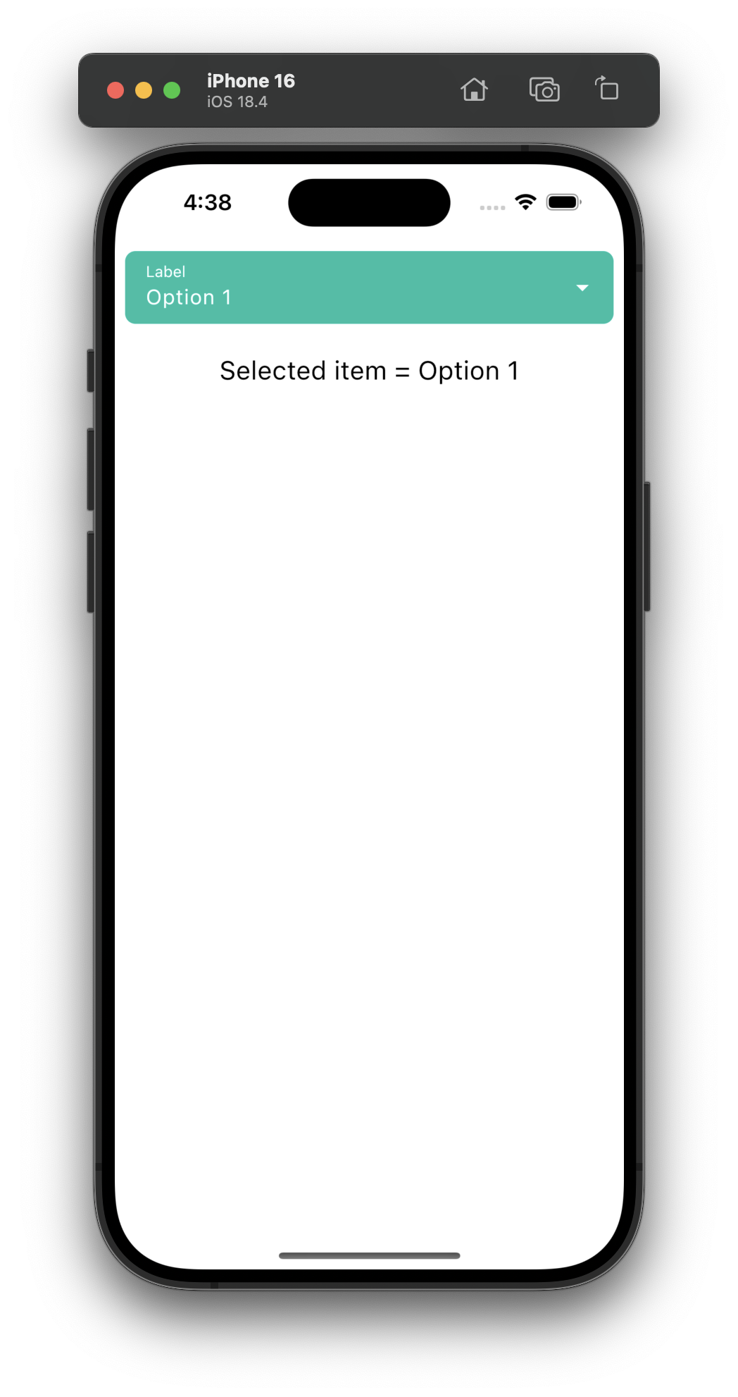
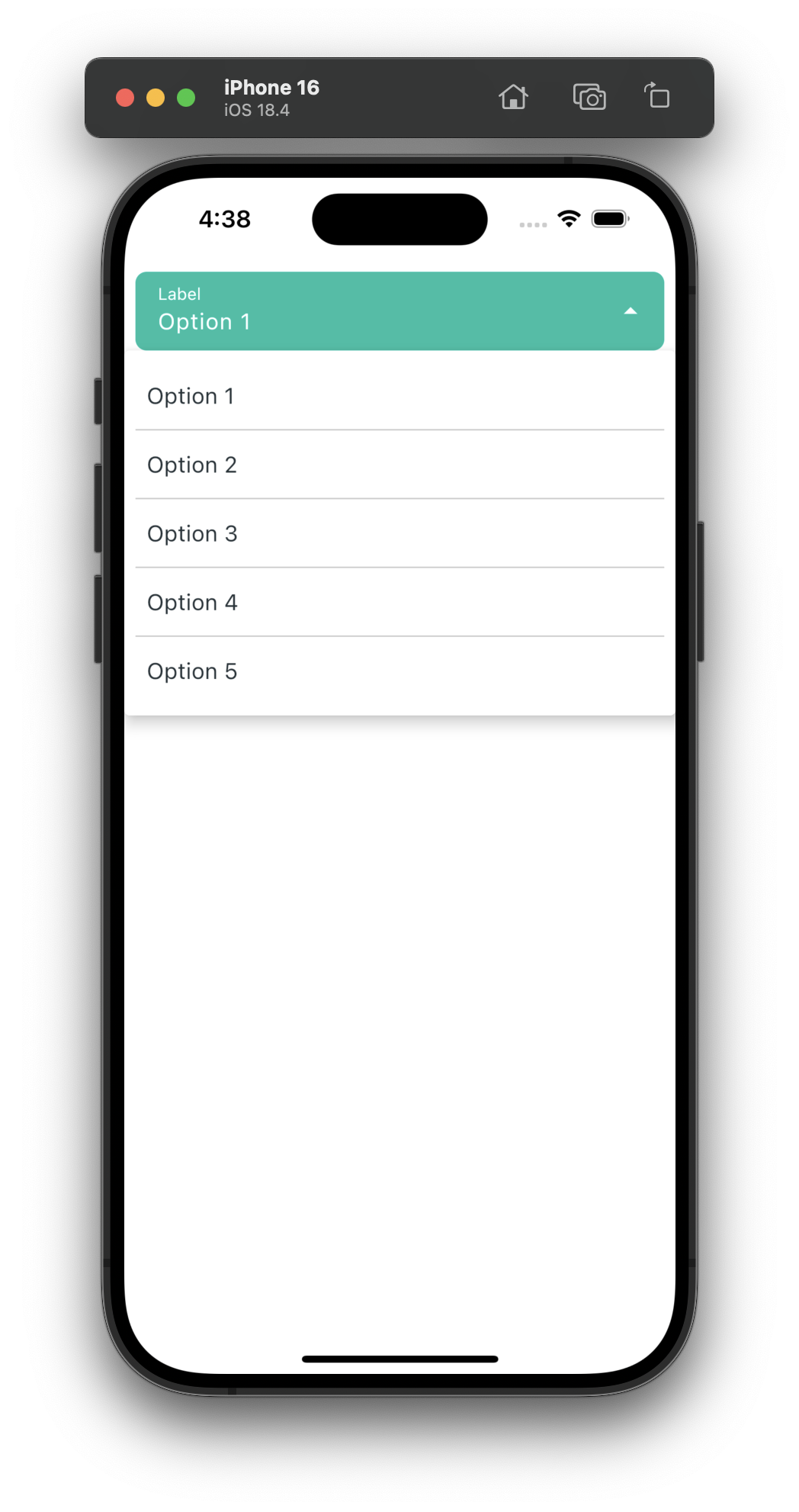
Screenshot on an iOS device: